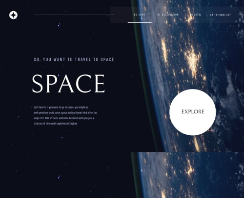
Space Tourism Website using HTML, CSS and Javascript

Solution retrospective
Any queries or suggestions are welcome
Please log in to post a comment
Log in with GitHubCommunity feedback
- @MojtabaMosavi
1- Spend some time reading about mobile first workflow which is a great way to approach responsive design in my opinion. It also reduces the amout of styles you need to write for a fully responsive solution.
2- A page like this and many other pages fit perfectly to this structure of new html 5 landmark elements, consider using them more frequently:
<body>
    <header> </header>
    <main> </main>
   <footer> </footer>
</body>
3- There are a alot of subtle issues when to semantic markup, for instance <p> elements being used for header. Writing fully accessible markup is not easy but in most cases similar to this answering a simple question like what is this piece of content ? would help a great deal.
4-I suggest doing you next more project spend a fair amout of time testing what you are developing, for us frontend dev chroms dev tool is of great help.
Keep coding :=)
Marked as helpful - @vBenTec
Hello, What I would suggest is to implement the hover effect on the landing page on the explore button. Another thing you could do is to use the view heights unit on the pages, there is a good use-case for that so you do not have the scroll down the page and all content is within the viewport.
You could also work a bit more on the responsiveness part. I noticed by resizing your window the page is stuck on the left side and you did not implement the mobile version, so work on your media queries. You could also have a look over your spacing.
Rest well-done congrats.
Marked as helpful - @skyv26
Hi! Honestly telling you, your design is not responsive, because your design not responsive it impact bad user experience that I felt after opening your site.
So first make it responsive then I will tell next
Marked as helpful


Join our Discord community
Join thousands of Frontend Mentor community members taking the challenges, sharing resources, helping each other, and chatting about all things front-end!
Join our Discord