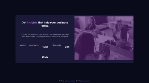
Stat Preview Card

Solution retrospective
This was so challenging. For the first time I tried the mobile first and desktop. When I did mobile version it went smoothly. but I was stuck on desktop version for so long. Still couldn't figure some things out as you can see on the site and github. so can anyone please tell me how can I do desktop version for this. I've been on this same challenge for past 2-3 days but today I thought I'll just ask here since I couldn't do it. so tell me somethings I should try to make desktop version? or should I start from desktop first ? any suggestions and criticism are highly appreciated! thank you.
Please log in to post a comment
Log in with GitHubCommunity feedback
- @MacChristo
Definitely, using flex is much easier than using grid. You wouldn't have to start worrying about which column or which row you element should be on.
- I recommend you have a div with a class name of "parent-container"
parent-container {
    height: 95vh;
    display: flex;
    align-items: center;
    align-self: center;
    justify-content: center;
2.Inside the parent-container div, insert a main-div that will contain your text and image.It should have two section tags. One for the image and one for all the texts. No styles to the sections
.main-div {
    display: flex;
    flex-direction: row-reverse;
3.Have a div in the first section for the image and give a background color.
.img-div {
    width: your desired width;
    height: your desired height;
    background-color: hsl(277, 64%, 61%);
    border-radius: 0 10px 10px 0;
}
4.insert your image into the img-div and style it.
.desktop-img {
    width: same width as your img-div;
    height: same height as your img-div;
    display: block;
    opacity: 0.8;
    mix-blend-mode: multiply;*<----- this will make your image blend with the background color of
   the img-div, creating the purple-like color of the image.*
    border-radius: 0 10px 10px 0;
5.In the second section tag, insert a div that will serve as container for all the texts.
.text-container {
    width: preferably same width as the img-div;
    height: preferably same height as the img-div;
    background-color: hsl(244, 38%, 16%);
    display: flex;
    flex-direction: column;
    align-items: center;
    align-self: center;
    justify-content: center;
    padding-right: 50px; *<----- this will give insert a space between the img-div and the text-container*
    border-radius: 10px 0 0 10px;
}
6.inside the text-container, insert a div and give it a margin of 30px to make spaces around the texts
text-div {
margin: 30px;
}
7.Then inside the text-div, you have 3 divs each for the three columns of text in the text section. 8.In the third div, you have the stats. Each stats should be in a div(stats-div) as The numbers as level 1 headings and the words under them as paragraphs .stats-div will contain 3 div for each stats.
stats-div {
    color: hsla(0, 0%, 100%, 0.6);
    margin-bottom: 15px;
    display: flex;
    flex-direction: row;
    align-items: center;
    justify-content: space-evenly;
}
Hope this helps.
Marked as helpful - @superschooler
Hi Sushant,
Great job on the mobile version - it looks very good! A couple of suggestions I have:
-
Make the media query larger so it doesn't transition until the screen is wide enough for it to look decent - maybe around 1000px.
-
Add the following CSS so the image fills the right half of the screen in your media query:
.image {
	height: 100%;
}

.image img {
	object-fit: cover;
	/* Prevents the image from distortion */
}
The issue with your .third-col element is that every item is individually put in containers. You can see the gridlines in this image. Changing your code to the following should fix it, since it keeps the children of your new
<div>element together:<div class="third-col"> <div> <p class="nums">10k+</p> <p class="stats">COMPANIES</p> </div> <div> <p class="nums">314</p> <p class="stats">TEMPLATES</p> </div> <div> <p class="nums">12M+</p> <p class="stats">QUERIES</p> </div> </div>You may need to work on the padding / margins after that, but it should do the trick!
Marked as helpful -
- @joaojgabriel
I honestly would've gone mad if I tried doing it with
grid. Usingflexin this case is way more straightforward, and perhaps more appropriate, since it makes sense to think of it from the content out. You won't be free from hassle, though. I had a lot of trouble with some tricky details ofmargin,padding,widthandheightto get the image to behave as intended, and I still couldn't make it perfect. Unfortunately, there isn't a single trick I can tell you that will magically solve it, or make you understand. You'll have to go through it on your own; only practice will truly help you learn. What I recommend is this:- Tale a step back, and some rest from this specific problem, until you're recharged and ready to go at it again, with less stress.
- Start from scratch, mobile first, but this time make it as simple as possible, and make sure you got the basics covered.
- Try making
flexwork with{ flex-direction: column }on mobile and{ flex-direction: row-reverse }on desktop. - When you get really stuck, reference my solution to see if there's something there that can help you.
Good luck, Sushant!
Marked as helpful


Join our Discord community
Join thousands of Frontend Mentor community members taking the challenges, sharing resources, helping each other, and chatting about all things front-end!
Join our Discord