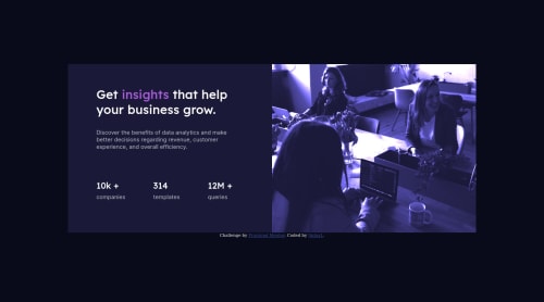
Stats preview card component

Solution retrospective
Any feedback appreciated, btw how do I completely change the design to mobile?
Please log in to post a comment
Log in with GitHubCommunity feedback
- @techanthere
You should design mobile-first, where you first design for mobile screen size and then apply media queries for larger screens like this:
@media only screen and (min-width: 768px) { code for this screen size}or apply large value for min-width like 1440px, which is the size of the screenshot you see above.
- @Nik0lcia
Looks good, only the picture color is different :) From what I've learned so far you can easily change the look by using bootstrap. You just need to set how components have to look on different screen sizes. You can do it in just CSS too, but it's harder this way.


Join our Discord community
Join thousands of Frontend Mentor community members taking the challenges, sharing resources, helping each other, and chatting about all things front-end!
Join our Discord