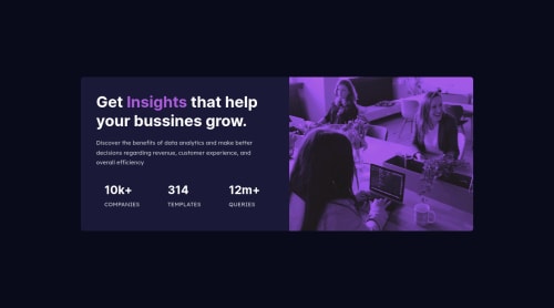
Stats preview card component

Solution retrospective
Hello!
Just trying mobile-first concept in a project. I'm going to add desktop media queries after.
Suggestions will be welcome!
Please log in to post a comment
Log in with GitHubCommunity feedback
- @attia-mahmoud
Hey Anderson! You did a great job so far with the project! I've got some quick tips that I think you'd find useful.
Firstly, I would give each div under the 'numbers' class a
display: flex; flex-direction: column; align-items: center;to center the text, just like the design. To do this, I would recommend having a shared class name between the three divs, for example, 'meta'. You can then changealign-itemstoflex-startwhen transitioning to the desktop design.Also, I would add
align-items: center;to the 'texts' class and set themax-widthof the paragraph to something like 30ch to match the design as well. Thechstands for characters and is useful when measuring text length.Finally, I noticed you added the image as a background-image. In this project, I would recommend using the
picturetag instead, which will help tremendously when you want to switch to the desktop image.Last note, I would recommend looking into using a class naming convention like BEM, which I think you would find useful.
Hope this helps and keep up the great work!

Join our Discord community
Join thousands of Frontend Mentor community members taking the challenges, sharing resources, helping each other, and chatting about all things front-end!
Join our Discord