Stats preview card component - flexbox, css variables

Solution retrospective
Any feedback is appreciated. The design files only showed a desktop and mobile view. In cases like that is it good practice to also make sure the the "tablet" view looks good too?
Please log in to post a comment
Log in with GitHubCommunity feedback
- @Syafiqjos
Hi @ACdev27,
Congratulations on finishing the challenge!
I checked the live website, it's working great and responsive but I have some opinion about them.
-
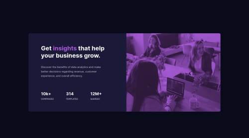
The card is seems to be really wide on max-width of 757px. The user who read the text probably got tired to read all the long from left to right. Maybe try to shrink it? so the text appear easy to read from top to bottom.
-
I see that you using manual margin for the stats. It's great but, there is other efficient and fast approach.
Change from this..
.stats {
  display: flex;
  justify-content: flex-start;
  margin-top: 18%;;
}
.stats div {
  margin-right: 15%;
}
.stats div:nth-child(3) {
  margin-right: 0;
}
Into this..
.stats {
  display: flex;
  justify-content: space-between;
  margin-top: 18%;
}
.stats div {

}
.stats div:nth-child(3) {

}
Also if you still want to use your current approach it's fine, but it's easier to change
div:nth-child(3)intodiv:last-childto make it even more versatile.-
Also I think it isn't necessary to put
altin the image, you could leave it emptyalt="", since it's not required for us to describe it. Usuallyaltis used to describe or make a more explanation to the user based on the paragraph or text. But in this challenge the image is only appeared as a background image, there is no relation between the text and stats. It's better that you userole="presentation"oraria-hidden="true"to make screen reader ignore that image. -
Last but not least, I think there is slight typo on the queries stats. It's should be "12M+" instead of "12m+".
Thats all from me, have a good day and keep improving!
- syafiqjos
Marked as helpful -

Join our Discord community
Join thousands of Frontend Mentor community members taking the challenges, sharing resources, helping each other, and chatting about all things front-end!
Join our Discord