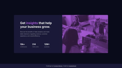
Not Found
Not Found
Not Found
Not Found
Not Found
Not Found
Not Found
Not Found
Not Found
Not Found
Not Found
Not Found
Not Found
Not Found
Not Found
Not Found
Not Found
Not Found
Not Found
Not Found

Submitted

Stats Preview Card Component 🎯 [ SEMANTIC HTML - BEM - VANILLA CSS3 ]

#accessibility#bem

@0xabdulkhalid

Desktop design screenshot for the Stats preview card component coding challenge

This is a solution for...

  • HTML
  • CSS
1newbie
View challenge

Design comparison


SolutionDesign

Solution retrospective


👾 Hello, Frontend Mentor Community,

This is my solution for the Stats Preview Card Component.

  • I learned to use mix-blend-mode to do some magic with header image
  • Layout was built responsive via mobile first workflow approach
  • Had a lots of fun building this challenge !
  • Feel free to leave any feedback and help me to improve my solution (or) make the code clean!

.

👨‍🔬 Follow me in my journey to finish all newbie challenges to explore solutions with custom features and tweaks

Ill be happy to hear any feedback and advice !

Community feedback

@Sinkycode

Posted

Congratulations 🎉🎉 mate

I really love your passion and the way you work on easy projects, not that you're not a pro but I think you still learn from them and mostly want to help us, beginners, on our road map to becoming confident developers.

So, we sincerely appreciate your efforts and to me, your aim for this particular challenge is to make sure your solution and the design are aligned correctly😊

2

@0xabdulkhalid

Posted

Thank you so much for your kind words @mosfresh ✨,

  • it means a lot to me coming from a fellow developer! I'm glad to hear that you appreciate my approach to working on projects, and that you recognize the value of learning from even the easier projects.
  • I am indeed passionate about helping beginners on their journey to becoming confident developers, and I always strive to provide solutions that are easy to understand and effective.
  • As for the current challenge, you are absolutely right that ensuring the alignment between the solution and the design is crucial. I always aim to provide solutions that are well-aligned with the given design, so that they are not only effective but also visually pleasing and user-friendly.

Thank you again for your positive feedback, and please let me know if there is anything else I can help you with ! 🤠

3

@TarundeepJoshi

Posted

Hello bro you complete your challenges so perfectly. Please tell me if I start a new challenge then from where I will start. Is first I build mobile screen or desktop screen.

0

@0xabdulkhalid

Posted

Thank you so much for your kind words @TarundeepJoshi ✨,

  • I personally recommend you to go with Mobile-first workflow, it's a design approach in which developers prioritize designing and developing a website or application for smaller screens, such as smartphones, before designing for larger screens, such as desktops. This approach has become increasingly popular due to the rise in mobile usage and the need for responsive design
  • The Mobile-first workflow can lead to better user experience, faster loading times, improved accessibility, and a scalable, simplified design that works well across all devices.
  • You can read more about this approach here 📕

.

Thank you once again, and please let me know if there is anything else I can help you with ! 🤠

1

Please log in to post a comment

Log in with GitHub
Discord logo

Join our Discord community

Join thousands of Frontend Mentor community members taking the challenges, sharing resources, helping each other, and chatting about all things front-end!

Join our Discord