Skip to content
  • Unlock Pro
  • Log in with GitHub
Solution
Submitted over 3 years ago

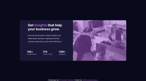
Stats preview card using flex box

Ali BENLEMMOUDEN•30
@AliBenlemmouden
A solution to the Stats preview card component challenge
View live sitePreview (opens in new tab)View codeCode (opens in new tab)

Solution retrospective


tell me how you did media queries?

Code
Select a file

Please log in to post a comment

Log in with GitHub

Community feedback

  • Raymart Pamplona•16,040
    @pikapikamart
    Posted over 3 years ago

    Hey, great work on this one. Layout in desktop looks great, though the responsive state could be better since if you try to inspect the layout, changing the screen's width before mobile breakpoint, content are being hidden. Mobile layout needs to have those font-size to be bigger since it is hard to read by now.

    I haven't tackled this one yet so I can't give an advice on it, but, if you do a site, always go with mobile first approach since this will make your layout easier to handle especially knowing what size to add a breakpoint.

    Some other suggestions would be:

    • Right now, your html or body tag has no height since you are using position: fixed on the main component. Never use position: absolute or position: fixed on a large container since this makes the element out of the flow which it currently does by now. Since you are just using it to position the layout in the center, you could have done it this way. First, remove all these props on the .container:
    position
    top
    left
    transform
    

    and on the body tag add:

    align-items: center;
    display: flex;
    flex-direction: column;
    justify-content: center;
    min-height: 100vh;
    

    This way you have avoided using position props and made the layout more flexible and proper usage of css.

    • Always have a main element to wrap the main content of your page. On this one, the .container should be using the main instead of div.
    • Hero-image could use a more descriptive alt since work-place is still ambiguous compared when you see the image itself.
    • Your .info could have used ul since those are "list" of information about the company website.
    • Also, inside in those list information, those text should not be using a heading tag because they don't really give content on what the section would contain right, so better using p tag on them.
    • The .attribution should be using footer so that its content is inside a landmark element. Also, remove the position on it as well the transform.
    • Lastly, making the site more responsive, maybe going with mobile first approach. Also the font-size in the mobile layout.

    Aside from those , great job again on this one.

    Marked as helpful
  • othman•120
    @othmanbenhamdoune
    Posted over 3 years ago

    the king keep going bro

Join our Discord community

Join thousands of Frontend Mentor community members taking the challenges, sharing resources, helping each other, and chatting about all things front-end!

Join our Discord
Frontend Mentor logo

Stay up to datewith new challenges, featured solutions, selected articles, and our latest news

Frontend Mentor

  • Unlock Pro
  • Contact us
  • FAQs
  • Become a partner

Explore

  • Learning paths
  • Challenges
  • Solutions
  • Articles

Community

  • Discord
  • Guidelines

For companies

  • Hire developers
  • Train developers
© Frontend Mentor 2019 - 2025
  • Terms
  • Cookie Policy
  • Privacy Policy
  • License

Oops! 😬

You need to be logged in before you can do that.

Log in with GitHub

Oops! 😬

You need to be logged in before you can do that.

Log in with GitHub

How does the accessibility report work?

When a solution is submitted, we use axe-core to run an automated audit of your code.

This picks out common accessibility issues like not using semantic HTML and not having proper heading hierarchies, among others.

This automated audit is fairly surface level, so we encourage to you review the project and code in more detail with accessibility best practices in mind.

How does the CSS report work?

When a solution is submitted, we use stylelint to run an automated check on the CSS code.

We've added some of our own linting rules based on recommended best practices. These rules are prefixed with frontend-mentor/ which you'll see at the top of each issue in the report.

The report will audit all CSS, SCSS and Less files in your repository.

How does the HTML validation report work?

When a solution is submitted, we use html-validate to run an automated check on the HTML code.

The report picks out common HTML issues such as not using headings within section elements and incorrect nesting of elements, among others.

Note that the report can pick up “invalid” attributes, which some frameworks automatically add to the HTML. These attributes are crucial for how the frameworks function, although they’re technically not valid HTML. As such, some projects can show up with many HTML validation errors, which are benign and are a necessary part of the framework.

How does the JavaScript validation report work?

When a solution is submitted, we use eslint to run an automated check on the JavaScript code.

The report picks out common JavaScript issues such as not using semicolons and using var instead of let or const, among others.

The report will audit all JS and JSX files in your repository. We currently do not support Typescript or other frontend frameworks.

Oops! 😬

You need to be logged in before you can do that.

Log in with GitHub

Oops! 😬

You need to be logged in before you can do that.

Log in with GitHub