Not Found
Not Found
Not Found
Not Found
Not Found
Not Found
Not Found
Not Found
Not Found
Not Found
Not Found
Not Found
Not Found
Not Found
Not Found
Not Found
Not Found
Not Found
Not Found
Not Found

Submitted

Stats preview card with HTML and CSS
Fer 50

@Numark12

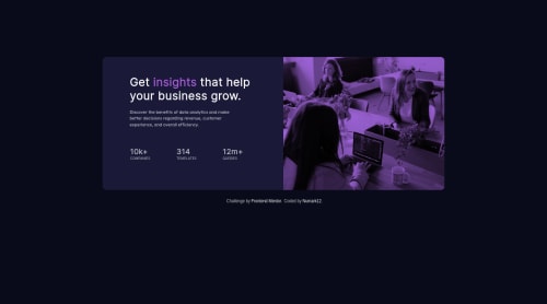
Desktop design screenshot for the Stats preview card component coding challenge

This is a solution for...

  • HTML
  • CSS
1newbie
View challenge

Design comparison


SolutionDesign

Solution retrospective


This is my first completed project. I would like to know some way to reduce lines of code in CSS (it was quite long for such a small page). Thanks!

Este es el primer proyecto que finalizo. Quisiera saber si hay alguna manera de reducir las líneas de código de CSS (quedó bastante largo para una página tan chica). Gracias!

Community feedback

Nic 595

@nicm42

Posted

Well done for completing this! I can see you've put a lot of thought into it.

CSS can just be lengthy sometimes, but there are some things you can do to help.

  1. You don't need two media queries. If you took off your min-width: 650px one so all the styles currently in there are just general styles, then any styles that don't fit the max-width: 600px one will be shown. So if your browser width is 601px you'll see the general styles at the top, if your browser width is 600px, you'll see the mobile-specific styles at the bottom. This also solves the problem of not having any styles if your browser is between 601 and 649px.

Basically, a media query will override any styles not specified above (and outside of) it. So if you have a background colour of red, then you have a max-width: 600px media query where you don't mention the background colour, it will be red no matter what size your browser is. But if you made the background colour green inside the max-width: 600px media query, then above 600px it will be red, below 600px it will be green.

In your CSS your .attribution has a lot of the same styles regardless of whether it's on desktop or mobile. If you put those styles that are the same at the top, as general styles, then in your mobile media query, you just have to specify the styles that are different. That'll reduce the line count by quite a bit.

  1. You've also made your life a lot harder by repeating the HTML. You just need it once and then you can control how it looks on desktop/mobile with your CSS. So for example, .back-mobile includes all the styles that .back has, plus some extra ones, and the HTML the same, aside from the class name. So if you just have .back, then in your mobile media query, you add those extra styles to .back.

I hope that makes sense - let me know if it doesn't and I will clarify/give more examples. It might help you to look at other people's solutions for this and see if you can understand how they did it - you can even download everything from their GitHub and change things to see how it all works.

Marked as helpful

1

Fer 50

@Numark12

Posted

@nicm42 Thanks Nic, your comment was very clear. It seems obvious now that 2 queries were not necessary. I will try to simplify the html as well. Thank you for your detailed answer.

0

@MartineauRemi

Posted

Hey ! Congrats on your first project ! You did a pretty good job :)

Here are some tips to reduce your css:

  • when you apply the same property to several elements, you can group them and call the property only once. So you can replace :
.card_mobile {
    display: none;
}
.inner_mobile {
    display: none;
}
.back_mobile {
    display: none;  
}
.imag_mobile {
    display: none;
}

With something like this :

.card_mobile, .imag_mobile, .inner_mobile, .back_mobile {
    display: none;
}
  • I see you duplicated some code in your media queries. For example, this code appears in your '@media (min-width: 600px)' :
.attribution { 
    margin: auto;
    margin-top: 150px;
    font-size: 11px; 
    background-color: hsl(244, 38%, 16%);
    width: 900px;
    height: 350px;
    display: flex;  
    border-radius: 10px;
}

Assuming you were working in a desktop-first approach, you dont have to copy all the properties in your other media queries, but only those who change. So in your '@media (max-with:600px)' you can change this:

.attribution { 
        margin: auto;
        margin-top: 150px;
        font-size: 11px; 
        background-color: hsl(244, 38%, 16%);
        width: 250px;
        height: 600Px;
        display: flex;  
        align-content: flex-start;
        border-radius: 10px;
        flex-wrap: wrap;      
    }

With this:

.attribution { 
        width: 250px;
        height: 600Px;
        align-content: flex-start;
        flex-wrap: wrap;      
    }

and keep all the code in the '@media (min-width: 600px)' but remove the media query itself. Try to find and delete the redundant code.

Keep up the good work, and happy coding ;)

Marked as helpful

1

Fer 50

@Numark12

Posted

@MartineauRemi Thank you very much Remi, I had not thought about grouping the properties, it makes a lot of sense! I will try to be more attentive to repeated properties. Thanks again for your time.

0
P
Jaydi 355

@ruedasjnthn

Posted

there are some things that you can work on to improve your website in my opinion

First is the typography make sure the heading stand out than the subheading, using font-weight bold might be the way to fix that

Somewhere at 620 to 635px the design become a mess, make sure to check your media queries to ensure fluid responsiveness

You might want to consider using percentage in you margin to have consistent margin in your card component

Marked as helpful

0

Fer 50

@Numark12

Posted

@ruedasjnthn Thanks Jaydy, your comments were very helpful to me. I liked the detail of the bold font (I had tried to fix it, but didn't know how). Also, from now on I'm going to use percentages instead of px (it makes a lot of sense). Thanks again for your time.

0

Please log in to post a comment

Log in with GitHub
Discord logo

Join our Discord community

Join thousands of Frontend Mentor community members taking the challenges, sharing resources, helping each other, and chatting about all things front-end!

Join our Discord