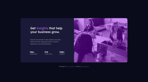
stats preview card with mobile first approach and css flexbox

Solution retrospective
I tried my best to make the image as close as the source. However, in the source, the image seemed a bit dark. How can I make it exactly like the source image?
Please log in to post a comment
Log in with GitHubCommunity feedback
- @correlucas
👾Hi Oishik Biswas, congrats on completing this challenge!
I've just opened your live site and I can say that you did a great job putting everything together! There's some tips to improve your solution:
Instead of using this code:
.card-image::after {
    content: "";
    inset: 0;
    position: absolute;
    background-color: rgba(157, 0, 255, 0.4);
    z-index: -1;
    border-radius: 0.9rem 0.9rem 0 0;
}
You can add the same effect of the design for the image overlaying it with
purplethere's a shortcut that is by usingmix-blend-modewith the modemultiplyand with an opacity aroundopacity: 82%. See the code below:img { mix-blend-mode: multiply; opacity: 82%;}✌️ I hope this helps you and happy coding!
Marked as helpful - @vanzasetia
Hello, Oishik Biswas! 👋
Before diving into the image overlay, I recommend using
pictureelement for the image instead of using a background image. This way, there's no need to specify any height for an image.After that, use
mix-blend-modeproperty and reduce the amount of theopacityof the image to0.75to make the overlay. This way, you can remove the pseudo-element. As a result, the image will look exact same as the design and with less code.If you want to see the end result of this approach, you can take a look at the @DarrickFauvel's solution for this challenge.
That's it! I hope this helps! 🙂
Marked as helpful
Join our Discord community
Join thousands of Frontend Mentor community members taking the challenges, sharing resources, helping each other, and chatting about all things front-end!
Join our Discord