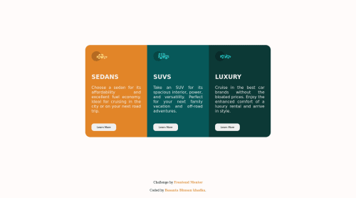
Submitted almost 4 years agoA solution to the 3-column preview card component challenge
stats-preview-card-component-main

@Basanta-afk
Code
Couldn’t fetch repository
Please log in to post a comment
Log in with GitHubCommunity feedback
- @jerry-the-kid
At the mobile design you can set :
.content-1 { border-bottom-left-radius: 0px}
.content-3 {border-top-right-radius: 0px}
More easy way is to have a div contain 3 div content and set it to have
boder-radius: 20px, overflow: hiddenMarked as helpful - @Basanta-afk
Please someone help me with the mobile design portion of it as i have been getting issue in border radius in cards

Join our Discord community
Join thousands of Frontend Mentor community members taking the challenges, sharing resources, helping each other, and chatting about all things front-end!
Join our Discord