Streamlining Design with a 3-Column Preview Card Component Solution

Solution retrospective
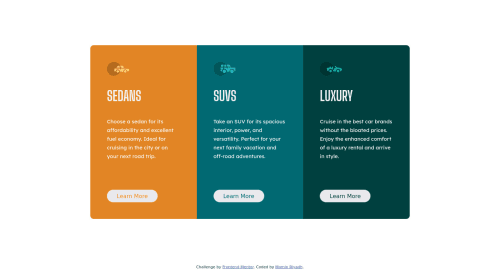
Hey everyone, I recently completed a project called Streamlining Design with a 3-Column Preview Card Component Solution which focuses on accurately translating UI concepts into code using HTML5, CSS3, and Javascript. I'm curious to know your thoughts on the project and if you have any feedback for me.
What do you think of the overall design of the 3-column preview card component solution? Is there anything you would change or improve?"
Please log in to post a comment
Log in with GitHubCommunity feedback
- @matusalab-dev
congrats for achieving this far... I've got a couple of suggestions, let's start with the animation when the cards return to their original position the overlapping of the card's transition isn't smooth. you can make the animation using a CSS property z-index. because the z-index property is animatable. the other one is responsiveness, your app is not responsive. you can make it responsive with a CSS grid or simply just use the flex-box flex-direction property from row to column at an appropriate breakpoint.

Join our Discord community
Join thousands of Frontend Mentor community members taking the challenges, sharing resources, helping each other, and chatting about all things front-end!
Join our Discord