


@PhoenixDev22
Posted
Hello David Trstenjak,
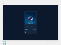
Great work! I have some suggestions regarding your solution:
HTML
-
First of all , you have used so may unnecessary <div> and <span>’s. Consider using semantic elements before these generic containers.(it’s not recommended to use
<div>and<span >alone to wrap meaningful content) -
There should be two landmark elements as children of the body element - a
main(which will be the NFT component ) and afooter(which will be the attribution).<Footer>should not be in the<main >. -
Page should contain a level-one heading. In this challenge , as it’s not a whole page, you can have
<h1>visually hidden withsr-onlyclass and use<h2>forEquilibrium #3429Or you can use<h1>for theEquilibrium #3429 -
Since there's a :hover state on the image and means it's interactive, So there should be an interactive element around them. When you create a component that could be interacted with a user , always remember to include interactive elements like(button, textarea,input, ..)
For this imagine what would happen when you click on the image, there are two possible ways:
1: If clicking the image would show a popup where the user can see the full NFT, here you use <button>.
2:If clicking the image would navigate the user to another page to see the NFT, here use <a>.
-
Also use
<a>to wrapJules Wyvern and Equilibrium #3429 -
The link wrapping the equilibrium image(
image-equilibrium) should either haveSr-onlytext, anaria-labeloralttext that says where that link takes you. -
Images must have alternate text
-
For any decorative images, each img tag should have empty
alt=""and addaria-hidden="true"attributes to make all web assistive technologies such as screen reader ignore those images in(icon-view, icon-ethereum, icon-clock). -
The avatar's alt should not be **empty **. You can use the creator's name
Jules Wyvern. Read more how to write an alt text -
You can use unordered list
<ul>to wrapclass="container4". In each<li>should be<img>and<p>, then you can align them centrally. -
If you wish to draw a horizontal line, you should do so using appropriate CSS. Remove the
<hr >, you can use border-top: to the avatar's part -
To use more semantic tags , you may use
<figure>and<figcaption>for the avatar's part.
CSS:
- These are the reason of content overflow.
width: 25%; and height: 70vh, it differs from a browser to another.Using percentages makes you lose the control of the layout Consider using max-width to the card instead.
It's not recommended to set height to component, let the content of the component define the height.
-
There are so many ways to add the hover effect on the image , The one I would use, using pseudo-elements to change the teal bg color to a hsla. Then opacity can be changed from 0 to 1 on the pseudo element on hover.
-
The icon view doesn’t really need to be in HTML , you can use CSS. AS there’s no need for another clutter in the HTML.
Aside these, Great work on this one. Hopefully this feedback helps.
Marked as helpful


