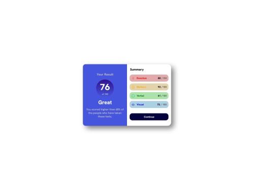
Submitted over 1 year agoA solution to the Results summary component challenge
Summary Car WebPage

@ChaosBlitz404
Solution retrospective
I feel getting better at this but I don't know some stuff :
- How to make it responsive ?
- Is the circle part good enough? it's my first time doing it.
Any feedbacks are welcome !!!
Code
Please log in to post a comment
Log in with GitHubCommunity feedback
- @Tolulope-as
Nice effort!! To make it responsive you will need to use a media query,you will need to set a max width at which your container flex direction will change to column for mobile screens e.g
@media screen and (max-width:600px){ .mycontainer { display: flex; flex-direction:column; } }This css code means at a screen width of 600px and below ur container's flex direction will no longer be row but column
I advise u to watch a video on responsive design and Media queries.
Marked as helpful

Join our Discord community
Join thousands of Frontend Mentor community members taking the challenges, sharing resources, helping each other, and chatting about all things front-end!
Join our Discord