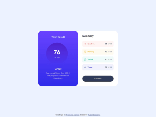
Summary component - Vanilla

Solution retrospective
Any constructive criticism or tips for improvement are welcome and appreciated.
Please log in to post a comment
Log in with GitHubCommunity feedback
- @hitmorecode
Nice well done looks good. Just a few tips
- When changing to mobile screen size the elements on the top section are not vertically aligned. To fix this add these css rules.
.purple { background: var(--gradient-1); width: 100%; padding: 1.5rem 45px 40px; color: #cac9ff; border-bottom-left-radius: 32px; border-bottom-right-radius: 32px; position: relative; /* add these lines */ display: flex; flex-direction: column; justify-content: center; align-items: center; }- Remove the border radius on the button.
- Add transition on the button to make the animation smoother.
I hope you find this helpful. Keep it up 👍👌
Join our Discord community
Join thousands of Frontend Mentor community members taking the challenges, sharing resources, helping each other, and chatting about all things front-end!
Join our Discord