


P
Fluffy Kas• 7,735
@FluffyKas
Posted
Hey,
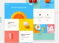
Your solution looks great and I can tell you put a lot of effort into this! The image-placement in some sections look a bit strange apart from the widths defined in the style guide but I haven't done the challenge so I can't really say how it could be done better. Looks neat enough anyway! There are some bits where this could be improved though:
-
I don't see any font-family imported, have you forgot this perhaps?
-
I see some empty selectors in your css file, you could remove these.
-
For your navigation you should use a <nav>.
-
You should add aria-labels to your social icons! Title isn't the best solution for this.
Everything else looks great, you even thought of adding some really nice alt texts to you images. Good job again ^^
0
