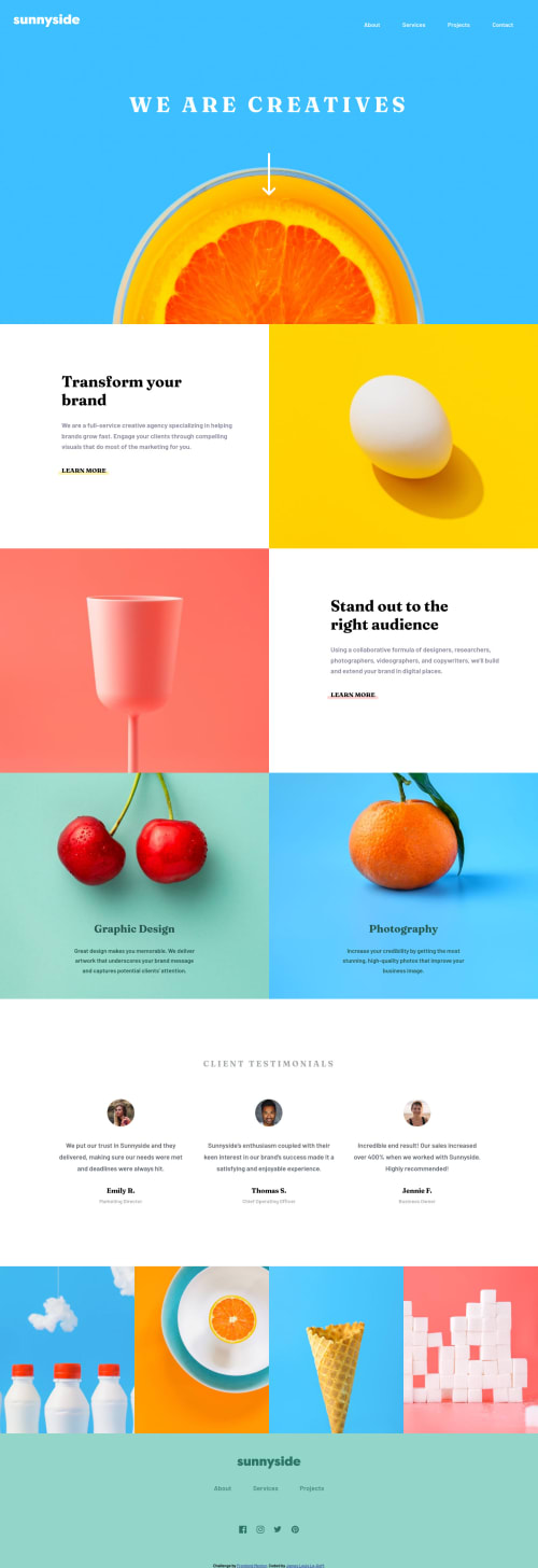
Sunny Landing Page built with - HTML5, CSS(GRID/FLEX), SASS, BEM, JS

Solution retrospective
Hi front end mentor community 😄,
This is my fifth project and I would really appreciate any feedback on the readability of my code. What are some things you liked? Where could my code have been cleaner? Shorter?
Any advice, tips or tricks are welcome 👍🏽
Happy Coding! 😁
Please log in to post a comment
Log in with GitHubCommunity feedback
- @pikapikamart
Hey, awesome work on this one. Desktop layout looks great, for the site responsiveness, it responds but if you go like 704px, you will see that contents are being squished along with the images and some text are being hidden by their counterpart images. For mobile state though, it looks great.
MikevPeeren already gave great feedback on this one, just going to add some suggestions as well:
- Don't use
width: 100vwsince this will only add a horizontal scrollbar at the bottom, since this value does not account the vertical scrollbar's width. - For this one, I would prefer the
headerto only contain the topmost part of the site, the website-logo and the navlinks. The reason is that, you want to make theheaderreusable on different pages of the site, by including the hero-section inside theheaderit won't be reusable since you don't want to include the hero-section for other pages right. Leave the hero-section to themaintag. - Put an
aria-label="primary"on thenavon theheaderso that it will be unique since we are going to use anothernavtag on the site. - Since the website-logo is not being treated as a link, you can remove it from the
navtag. - Remember that a website-logo is one of the meaningful images on a site so use proper
altfor it. Use the website's name as the value likealt="sunnyside". - Those 4 links could be wrapped by a
ultag since those are "list" of links. - For the hero-section and for other parts of the site that uses
sectionchange those intodivsincesectionalone is not informative as a landmark since it doesn't give any extra information unless it is labelled byaria-labelledbyattribute. - The arrow-down-icon is only decorative. Decorative images should be hidden for screen-reader at all times by using
alt=""andaria-hidden="true"to theimgtag or onlyaria-hidden="true"if you are usingsvginstead ofimgtag. - Only use descriptive
alton images that are meaningful and adds content to the site otherwise hide the image for screen-reader users. - Those other images, like the egg, glass fruits etc. Those are only decorative images on the site as well so hiding them would be great, use the method I mentioned above.
- For each of the
atag that containslearn moreif you hover on its right side, it is still clickable since it is using the full width of the container. You can usemax-width: max-contenton it so that it will be capped. - For each testimonial person. Person's image should be using the person's name as the
altvalue likealt="Emily R.". Components like this where a person's information is presented, make sure to use their name as the person'simgaltvalue. - Also, you can make use of this markup so that it will be easier for screen-reader users to navigate the testimonials using blockquote:
<figure>
  <img src="" alt={person name}>
  <blockquote>
    <p> {qoute in here}</p>
  </blockquote>
  <figcaption>
    person name
    <p>
      person role
    </p>
  </figcaption>
</figure>
FOOTER
- Since you are using
svgfor the website-logo, use this markup to give it an alternative text:
<svg role="img"> <title>Sunnyside</title> </svg>- Those 3 links below the website-logo could be wrapped inside a
nav, just make sure to addaria-label="footer"on thenavso that it will be distinct. Also you can again useulsince they are "list" of links:
<nav> <ul> list of links </ul> </nav>- Those social-media links could be inside a
ulelement since those are "list" of links. - Each
atag that wraps the social-media icon should have eitheraria-labelattribute orsr-onlytext inside it, defining where the link would take them. For example, you should usefacebookas the value if the link would take the user to facebook. - Social-media image should be hidden since it is only a decorative image so use
aria-hidden="true".
MOBILE
- Your hamburger-button should have either
aria-labelattribute orsr-onlytext inside it which defines what thebuttondoes. It could be something likearia-label="navigation menu dropdown". - The hamburger
buttonshould have a default attribute ofaria-expanded="false"and it will be set totruewhen the users toggles it and vice-versa. - The
imginside the hamburger-menu should have been hidden since it is only a decorative image.
Aside from those, great job again on this one.
- Don't use
- @MikevPeeren
Hey 👋
Good job completing this project 👏
Try to keep in mind when using alts if for one the image is needed for screenreaders to understand for example the arrow down isn't as its only decorative. And for the hamburger menu a more descriptive text would be better as not everyone knows what a hamburger menu is.
As for your code I would advise to use BEM or other methodology for sass as it would be more readable. http://getbem.com/


Join our Discord community
Join thousands of Frontend Mentor community members taking the challenges, sharing resources, helping each other, and chatting about all things front-end!
Join our Discord