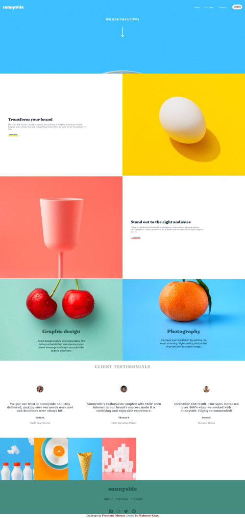
Sunny Side Landing Page CSS GRID

Solution retrospective
I'm pretty much satisfied with the layout still your recommendations are welcome Thanks:)
Please log in to post a comment
Log in with GitHubCommunity feedback
- @darryncodes
Hi Mahnoor,
Some good suggestions already.
- i'd add some
padding-bottom: 20em;to your.headerto help the image not get lost on larger screens - here is some useful information about what css units to use the browser default for font-size is 16px, that is a good starting point for you as it's quite small now
I'd highly recommend checking on this free course
Happy coding!
Marked as helpful - i'd add some
- @anoshaahmed
To get rid of the accessibility/HTML issues shown in your Report:
- wrap everything in your body in
<main>... OR use semantic tags! .... you can also giverole=""to the direct children of your<body>but that's a little frowned upon... Click here to read more - start your headings with
<h1>, and move up by one level each time <a>should have anaria-label... Click here to read more<li>should be inside a <ul> or <ol>
Good work on this Mahnoor! :)
Marked as helpful - wrap everything in your body in
- @remusbuhaianu
Good job on completing the challenge, @mahnoork18 !
I had a look at your final solution and here are a few suggestions based on that:
-
On larger screen sizes, the orange img at the top isn't displayed properly - you only see the top of it
-
The text is too small
-
The 4 images at the bottom don't take up the entire available width
-
Responsive design needs a bit of polishing, especially for the .ct-section and the gallery section
Hope this helps. Keep up the good work!
-


Join our Discord community
Join thousands of Frontend Mentor community members taking the challenges, sharing resources, helping each other, and chatting about all things front-end!
Join our Discord