Not Found
Not Found
Not Found
Not Found
Not Found
Not Found
Not Found
Not Found
Not Found
Not Found
Not Found
Not Found
Not Found
Not Found
Not Found
Not Found
Not Found
Not Found
Not Found
Not Found

Submitted

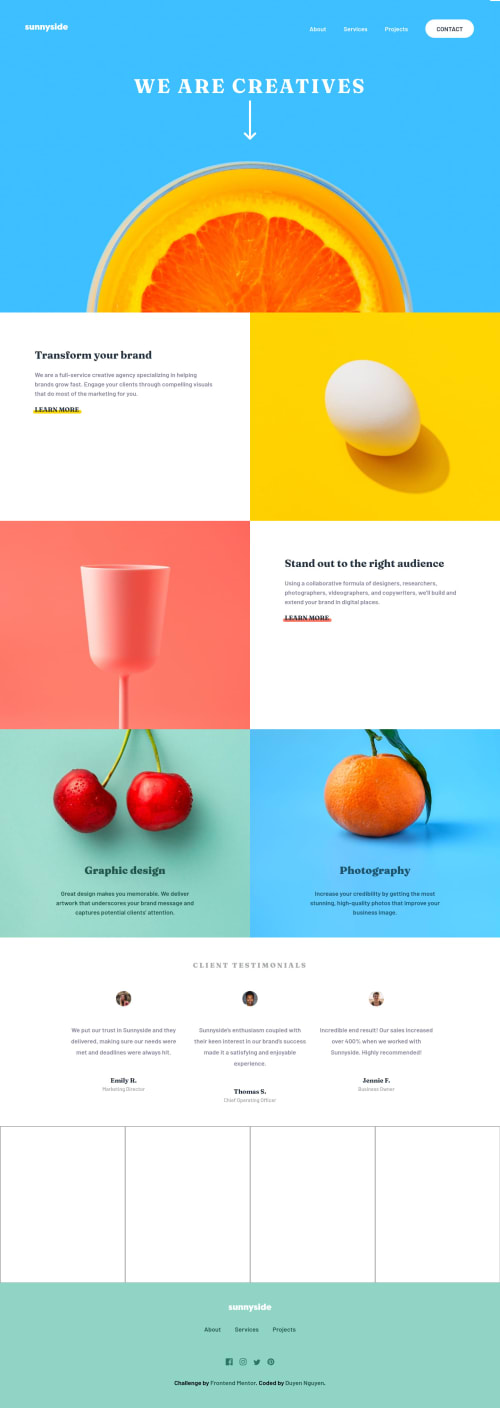
Sunnyside Agency - HTML, CSS Grid/Flex, JS

@Duyen-codes

Desktop design screenshot for the Sunnyside agency landing page coding challenge

This is a solution for...

  • HTML
  • CSS
  • JS
2junior
View challenge

Design comparison


SolutionDesign

Solution retrospective


One thing I haven't figured out is the footer on desktop mode becomes have its own space somehow. Been sitting on this problem for more than an hour. I'd be grateful if you can have a look at my codes and direct me to the right path. Thanks a lot!

Community feedback

P
David Turner 4,110

@brodiewebdt

Posted

Your welcome. It took me a while too. I have to go back to some of my older solutions and fix the problems with the accessibility. I found that extension a couple of weeks ago, and it is a big help. I try to recommend it as much as I can.

Marked as helpful

0

@Duyen-codes

Posted

@brodiewebdt Great! Thanks again!

1
P
David Turner 4,110

@brodiewebdt

Posted

The footer looks fine to me as well.

To clear the accessibility warnings, add an aria-label= "nav" to the nav element. Add ALT to the logo image. Put sunnyside logo in the alt text in the main nav and the footer and it will clear that one. Add aria-labels to the a tags in the footer. IE: aria-label="Facebook link" That will clear the rest of the accessibility warnings. Download AXE DevTools to clear accessibility issues while you are coding. https://www.deque.com/axe/devtools/

Hope this helps.

Marked as helpful

0

@Duyen-codes

Posted

@brodiewebdt Hey! Thanks for your time of looking at my codes and feedback. I'll definitely try to pay more attention on accessibility gradually. Sometimes there are too much to solve while coding that I did not care enough for these details. Thanks for sharing the resource as well. Greatly appreciate that!

0
Rafal 1,395

@grizhlieCodes

Posted

Nice solution!

I'm not sure I understand the issue exactly, the footer looks fine to me unless I'm missing something obvious 😅.

What do you mean by 'own space'?

Marked as helpful

0

@Duyen-codes

Posted

By that I mean the content of the footer stays on top of the image gallery area.

0
Benja.min 740

@BenjaDotMin

Posted

@Duyen-codes Hiya! You seem to have set a fixed height on .gallery-container:

height: 45rem;

Maybe remove it and let the images dictate the height.

I hope that gets you a bit closer to what you're after :)

Marked as helpful

0

@Duyen-codes

Posted

@BenjaDotMin Yayyy! Thanks! I've got this prob fixed. Thanks so much!

1

@Duyen-codes

Posted

@BenjaDotMin May I ask how did you find where the prob was coming from? I used dev tools on chrome but couldn't figure out.

1
Benja.min 740

@BenjaDotMin

Posted

@Duyen-codes Sure of course. Mainly I have shared your pain and fell into this trap many times haha, so I just learn what to check, by failing in the past :)

But what mainly stood out, was I had dev tools open in chrome, hovered over .gallery-container (to highlight its dimensions in the page) and saw its height was off. So toggled your css on that, until I got lucky! Bad description, but hope it helps you debug layout in future :)

Marked as helpful

1
Benja.min 740

@BenjaDotMin

Posted

@Duyen-codes Absolutely welcome :)

0

@Duyen-codes

Posted

@BenjaDotMin I see! Thanks a lot for sharing! I really appreciate your help! I'm learning web dev to change career completely on my own so I believe I've got a lot to learn from you!

1
Benja.min 740

@BenjaDotMin

Posted

@Duyen-codes Never a problem! Happy to help. I really hope your career change goes well, and you are certainly on the way to a good career!

Marked as helpful

0
Rafal 1,395

@grizhlieCodes

Posted

@Duyen-codes To add to what Ben already said about height, in general avoid setting a fixed height.

You can set a min-height and that usually won't affect anything negatively if you're following some specific design. I set a min-height: 100vh for the body element 99% of the time for example.

But in general you want to build 'responsive' components, websites etc. And for that to happen we can't set fixed heights almost ever in a way as we don't know the screen size someone will use. If their screen size for example is 300px then a fixed width of 350px would mess stuff up. Or a fixed height would potentially mess things up simply because the content doesn't have enough horizontal room anymore.

Marked as helpful

0

@Duyen-codes

Posted

@grizhlieCodes Thanks for the insights! Greatly appreciate you!

1
Rafal 1,395

@grizhlieCodes

Posted

@Duyen-codes No problem. Keep it up though, you're doing really well. I didn't know you're learning to switch careers, I salute you for that - I'll be switching from finance myself when the time is right.

Carry on building these projects, your speed is pretty great. And this community is generally great to learn with/from so there's that too.

Marked as helpful

0

@Duyen-codes

Posted

@grizhlieCodes Thanks for encouragement and great help! Yeah I'm learning to change career. I learned that you are also trying to switch career while still working 2 finance jobs when I visited your website. I'm very impressed and inspired by that. I quit my job in July 2021 and been learning full time Mon-Fri since the beginning of August 2021. In every project I've done, I usually get stuck somewhere, more or less, that's when I go to the page to look at others' solutions. I've learned a lot from you. I'll try to keep going. Good luck to you too for the time ahead!

0
Rafal 1,395

@grizhlieCodes

Posted

@Duyen-codes Getting stuck all the time is a great sign overall, means you're leaning new stuff on every project :D

Later down the line when you know way more, a new project is usually a way to improve upon existing knowledge but overall you don't learn as much, especially if you don't/can't pick the projects carefully.

Awesome that you can study this full time, must be quite nice to be able to do that, I can only imagine hehe. Keep up the great work though, I'm pretty certain you'll get what you want in the end (people who work smart towards their goals usually do, ey??) 😁👍

0

@Duyen-codes

Posted

@grizhlieCodes What do you mean by this: 'a new project is usually a way to improve upon existing knowledge but overall you don't learn as much, especially if you don't/can't pick the projects carefully.'? I feel like I usually jump onto new project after another. Could you elaborate a bit more? I'd like to hear your advice!

0
Rafal 1,395

@grizhlieCodes

Posted

@Duyen-codes Lets go with frontend mentor:

When you select a new project pick the one that will teach you the most. That's all. You will spend similar amounts of time on various projects but some will certainly end up teaching you more. Like the 'time-tracking-dashboard' project. You weren't comfortably with the JS side. You got stuck on injecting stuff into HTML. Focus on that kind of stuff. Like this one to practice JS for example.

Or in this project, you set a fixed height. It was a mistake. Great! Now read a bit into the best practices and then do a project with which you can focus on pinning the best practices in your mind. Basically have these mini-learning-goals within each project you do. Be very mindful of how you spend your time and what you will get out of it.

Before I start a project I do some thinking/planning on it to see if it's worth doing. If I realise there's a technology or method or concept that's new, I will usually do it. If not, I will skip it as I can spend time doing something that will teach me more.

Marked as helpful

0

@Duyen-codes

Posted

@grizhlieCodes Totally agree! I'll keep those words in mind. I'll probably read this comment again to remind myself. :D Thanks a lot!

1
P
AK 6,700

@skyv26

Posted

Hi! Duyen, I have noticed some issues.

add . before images/

<section class="gallery-container"> <img src="/images/mobile/image-gallery-milkbottles.jpg" alt="" class="gallery__image mobile"> <img src="/images/mobile/image-gallery-orange.jpg" alt="" class="gallery__image mobile"> <img src="/images/mobile/image-gallery-cone.jpg" alt="" class="gallery__image mobile"> <img src="/images/mobile/image-gallery-sugar-cubes.jpg" alt="" class="gallery__image mobile"> <img src="/images/desktop/image-gallery-milkbottles.jpg" alt="" class="gallery__image desktop"> <img src="/images/desktop/image-gallery-orange.jpg" alt="" class="gallery__image desktop"> <img src="/images/desktop/image-gallery-cone.jpg" alt="" class="gallery__image desktop"> <img src="/images/desktop/image-gallery-sugarcubes.jpg" alt="" class="portfolio__image desktop">
</section>

.footer-social { margin: 4rem auto 0; }

This is your mistake. Correct and check again. All will be fine.

0

@Duyen-codes

Posted

@skyv26 Hey! THanks for pointing out the issue with those images. I've added . before those, now they all display as expected. The footer problem is still unknown to me why. I tried commenting out this line .footer-social { margin: 4rem auto 0; } but it did not make any difference. Could you please elaborate a bit more? Thanks a lot!

1

Please log in to post a comment

Log in with GitHub
Discord logo

Join our Discord community

Join thousands of Frontend Mentor community members taking the challenges, sharing resources, helping each other, and chatting about all things front-end!

Join our Discord