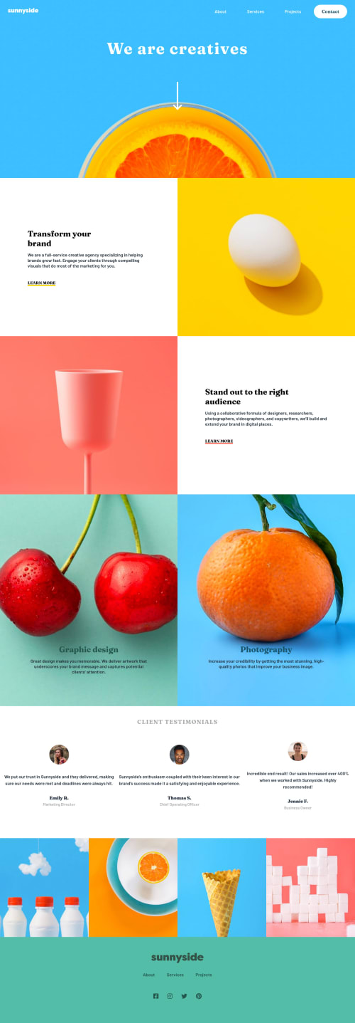
Submitted almost 4 years agoA solution to the Agency landing page challenge
Sunnyside agency landing page

@muben88
Solution retrospective
Hello, Frontend Mentor people! Hope you're doing great! This is my solution for the Sunnyside agency landing page.
Happy to hear any feedback and advice.
Code
Loading...
Please log in to post a comment
Log in with GitHubCommunity feedback
No feedback yet. Be the first to give feedback on Mustapha's solution.
Join our Discord community
Join thousands of Frontend Mentor community members taking the challenges, sharing resources, helping each other, and chatting about all things front-end!
Join our Discord