


@Sakeran
Posted
Hi Amos,
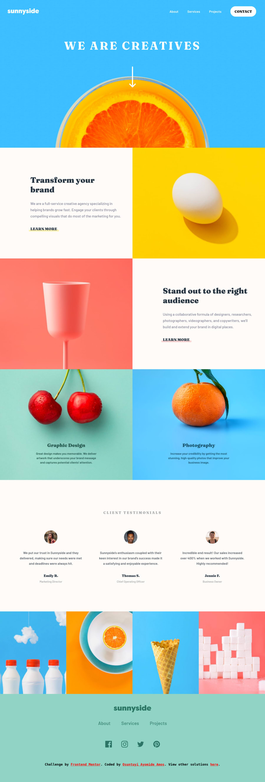
Nice job building out this project. I remember this layout being on the trickier side when I worked through it myself, particularly on very large screens. Most of the designs on FEM don't really specify how a layout should scale past a width of 1500px or so, which can pose a challenge when decorative elements start interacting with the edge of the screen.
In your case, it looks like you chose to constrain the "about" and "projects" sections to around that 1500px (or 90-ish rem) mark using max-width. This is by no means wrong, and it has the nice effect of keeping the images from scaling without bound. It does leave a fair amount of whitespace on either side of the sections after the screen grows past the constraint, which I found to be a little distracting.
There are a few ways to address the whitespace issue, if it bothers you. One way is to simply embrace the "full bleed" effect, as shown in the mockup. This was my solution, and it does cause the images in the design to scale up beyond the point of comfort, but it at least doesn't contradict the design.
Another option (which I just noticed after playing with your solution for a bit in my dev tools) is to just give the section backgrounds a color other than pure white. For example, try using the same blue from the hero section in the background of the 'about' section (or just look at this screenshot.) A solid background color wouldn't be a solution for every design, but in this case I think it actually works pretty well, and doesn't distract as much.
The layout wasn't actually meant to be my main point here (I'm easily distracted by design choices). More importantly, there are a few places where you could improve the quality of your animations with respect to accessibility and browser support.
The first (and probably most important) point has to do with the fact that there is no way to turn off the animations on your page. If you check MDN's page on the transform property, you'll notice the warning that certain kinds of animations can actually cause some users pain, which will prevent them from using your website. The simplest solution to this, as the page notes, is to make use of the prefers-reduced-motionmedia query, which will apply certain styles only if the user has opted into them at the OS level.
Secondly, I noticed an issue browsing this page with JavaScript turned off - namely that I can't see most of the content. It is still there, in the DOM. But because there is no JavaScript to set up your IntersectionObserver, there is never any point at which the show class is added to these elements. Not every website can or should be required to work without Javascript, but it is something of a flaw for pages like this where most of the content is non-interactive.
One common solution to this is to set some no-js class on the body element by default, and then update your hidden rules to only take effect if that class is not present on the body:
/* example */
body:not(.no-js) .hidden {
	/* rules */
}
Then, the first thing your JS file should do is remove the no-js class from the body. Everything should still work as expected, and users without JS will be able to see your content.
By the way, if you're using Firefox or Chrome, I use the Disable JavaScript plugin to easily toggle JS on and off. It's useful for quickly catching issues like the one above.
Last minor note: you left a console.log call in your IntersectionObserver callback, which causes some unnecessary spam in the console. I do this all the time too, though, and I'm not sure there's a cure for this mistake.
Hope this was helpful.
Marked as helpful
