Not Found
Not Found
Not Found
Not Found
Not Found
Not Found
Not Found
Not Found
Not Found
Not Found
Not Found
Not Found
Not Found
Not Found
Not Found
Not Found
Not Found
Not Found
Not Found
Not Found

Submitted

Sunnyside Agency Landing Page | HTML CSS TS

#accessibility#sass/scss#vite#typescript
AntoineC 1,180

@AntoineC-dev

Desktop design screenshot for the Sunnyside agency landing page coding challenge

This is a solution for...

  • HTML
  • CSS
  • JS
2junior
View challenge

Design comparison


SolutionDesign

Solution retrospective


Hello everyone. This is my solution for the Sunnyside Agency Landing Page challenge.

This project was pretty much a CSS-only challenge. I chose this one thinking "I am going to chill with a Junior Project" and let me confess: It was not easy.

Many hard choices especially with the images! I chose to add them in the markup instead of using the CSS background-image because it seems to me that they are as important as the rest of the content. This decision led to more absolute positioning than I'm used to.

I am not really pleased with the current layout above 1440px. The images are not wide enough for this, so it gets really pixelated.

I can't really add a max-width to the whole thing tho it does not look like this type of layout. If you think about a solution feel free to share! 😄

Thank you for your time. Have a good day/night. Peace 😀

Community feedback

Elaine 11,420

@elaineleung

Posted

Hi Antoine, great job here as usual! I did this challenge a while back, and I pretty much share the same thoughts you had. I think the most challenging thing for me was in how to make the images look optimal at the appropriate widths and breakpoints, especially in making sure the image with text on top won't have important features covered by text.

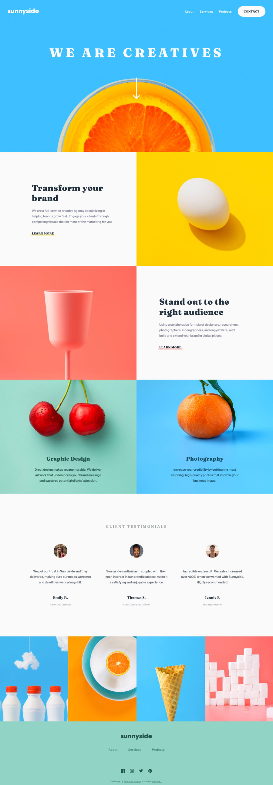
By the way, I agree with you about the images being important content, as I also felt that the visual content is a crucial aspect, especially for a creative agency. This is a comment I usually make in these solutions whenever I see others using them as background-image. I think I only had two images turned into background-image (the "photography" and "graphic design" ones), but I agree with your choices and might try the same if I did this again.

I don't really have suggestions, but just one thing to note: Shortly past the 768px breakpoint, the titles in the "photography" and "graphic design" sections are overlapping with the images and can be a bit hard to read, so you might want to try changing the height of the section or the breakpoint.

Marked as helpful

1

AntoineC 1,180

@AntoineC-dev

Posted

@elaineleung Hello Elaine. actually i did not see that. i will 100% try and fix that. I really appreciate your comment Elaine Ive looked at many of your projects and you write really clean code! I am also impressed by how pixel perfect you get without the figma files. So any positive comment from you is extra-appreciated by me. Peace 😊

1
Elaine 11,420

@elaineleung

Posted

@AntoineC-dev Aw thanks for the comment, Antoine, that means a lot to me! 😊

1

Please log in to post a comment

Log in with GitHub
Discord logo

Join our Discord community

Join thousands of Frontend Mentor community members taking the challenges, sharing resources, helping each other, and chatting about all things front-end!

Join our Discord