


@seekinfox
Posted
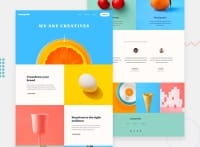
website is not responsive enough, the layout broke when i opened it in mobile view and in laptop view (1350px+?).
menu looks broken when opened, make it look clean when opened.
sorry for the critics. :)
Marked as helpful
@sophieQuin
Posted
@seekinfox Thank you for your feedback! I appreciate it. What dev tools do you use ? It works quite well on Firefox, Google Chrome seems unreliable.
The website is responsive from 375px, I admit anything lower and it start too look very tight.
When you say the "menu looks broken when opened". ?
Don't apologies for constructive criticism, that's why I am here ;)
@seekinfox
Posted
@sophieQuin I also use Firefox mainly in Linux mint but the functionality shouldn't differ. when i opened it on smaller browser window it did not show me the layout it suppose to show.
i think creating mobile first layout will really help you.
as for menu bar
the icon for menu is align right:0 to the screen and kind of overlaps with slider which makes it 'not want to click'.
when opened, the list-items/ links are aligned left, and menu itself is align to the right.
you can give menu some margin and padding for inner links, make menu little bigger. center it's text. use different font.
In hover you can give some side padding, they'll look much better.
and menu is not in line with page logo. it's down _-up
you can check out my live prev for this challenge for a better idea.
Marked as helpful
