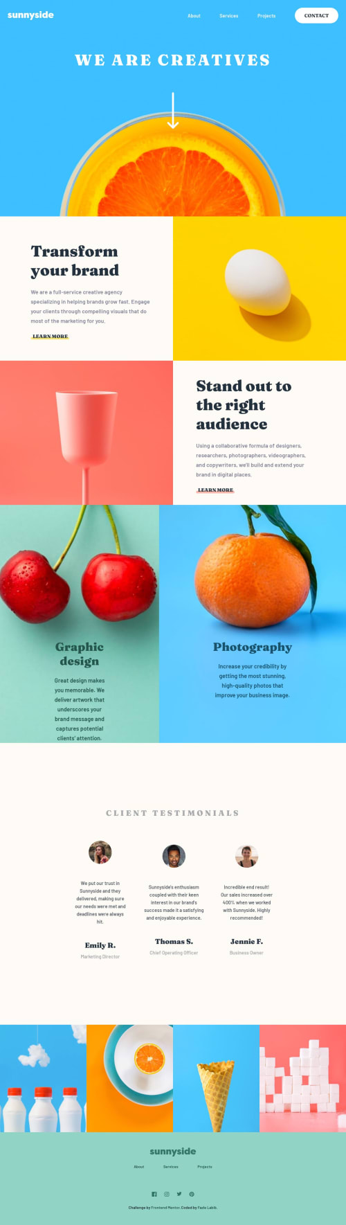
Sunnyside agency landing page using Flexbox, CSS Grid and JavaScript

Solution retrospective
Would like to know what is the best way of creating the services section which consists of Graphic Design and Photography. I had a hard time positioning the text over the image to keep it consistent for different screen sizes.
Any other feedback regarding the whole design and suggestions on making the code more efficient is highly appreciated.
Please log in to post a comment
Log in with GitHubCommunity feedback
- @Kemystra
Another way you may consider is to ditch the use of padding for class
service-content. Instead, set the propertyjustify-contenttoflex-end. All of the text will then go to the bottom, and you can set the gap between them with thegapproperty (or just usemargin, I guess). This guarantees your text to not overflow due to lack of empty vertical space.To do that however, you need to have a fixed height for the
services-itemclass. One trick that I used is to set theaspect-ratioto be the same as the background-image's aspect ratio. For example, if the image is 400x500 in resolution, then I will doaspect-ratio: 4 / 5. This will maintain the div's proportion to the image.Marked as helpful - @ogunsanwodavid
Alright, The best way to achieve this is to create a div (wrapper) with the respective images as backgrounds and then create another div inside containing all the texts and give it margin-top:auto so they can be always positioned at the far bottom. You should also give the wrapper or container a padding so the texts dont sit right on the bottom of the wrapper. I hope this helps.


Join our Discord community
Join thousands of Frontend Mentor community members taking the challenges, sharing resources, helping each other, and chatting about all things front-end!
Join our Discord