


@pikapikamart
Posted
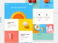
Hey, great work on this one. Though the desktop layout looks different since containers have its children overflowing from its container and on the testimonial section, you forgot to make it in a row right now they are stacking on one another. Site is responsive though and mobile state looks fine actually.
Some suggestions would be:
- Avoid using
idto target and style an element since it is a bad practice due to css specificity. Instead, just useclassto target element. - Avoid using
vhunit onheightproperty as it is not consistent. Try to inspect the layout in dev tools at the bottom, you will notice that when you resize the dev tools height, the layout changes. Instead useremunit so that it will be consistent. - Also I wouldn't add the hero-section inside the
headerand instead put it in themain. - Your website-logo should not be inside the
navsince it is not being treated as a link and do not add it inside theul. - Only
lielement is allowed as a direct child ofulso on yourheaderremove thedivinside of thenav > ul. - Also,
liparent should beuland notdiv. For this one, those 4 links are the only ones that should be insidenavandul. - Do not remove the
outlinestyling. If you did, always include a visual-indicator on the:focus-visiblefor those interactive elements like thebuttonatag and others. - Change
sectionto usingdivsincesectionis not informative when navigated via landmark unless it is being labelled byaria-labelledBy. - To fix those heights on your layout, for each
.section-image-container, remove theheightdeclaration. This makes the container limited while the image inside it is wider/taller than the parent. learn morewould be better to useatag rather thanbuttonsince on a real site, this would take a user to a page where they can "learn more" about the section.- For each testimonial card, you could use this markup for better navigation:
<figure>
  <img src="" alt={person name}>
  <blockquote>
    <p>
      {qoute in here}
    </p>
  </blockquote>
  <figcaption>
    person name
    <p>
      person role
    </p>
  </figcaption>
</figure>
- Also, each person's image should not be hidden since on a testimonial, you are highlighting a person, thus making them the focal point, hence their image/profile should always be visible.
FOOTER
- Those 4 images should not be include inside the
footersince normally, you would make thefooterreusable for different pages on the site, by including the image, it would look odd don't you think. - Website-logo is too big, reduce its size:>
- Those 3 links below the logo could be inside
ulsince those are still your website's navigational links. - Each
atag that wraps the social-media icon should have eitheraria-labelattribute orsr-onlytext inside it, defining where the link would take them. For example, you should usefacebookas the value if the link would take the user to facebook and not theimginside it. - Social-media image should be hidden since it is only a decorative image so use
alt=""andaria-hidden="true".
MOBILE
- Hamburger menu should be using a
buttonsince it is an interactive component. - Also, remember that when you are creating interactive components, always use interactive elements.
SUPPOSING BUTTON IS USED
- The
buttonshould have a default attribute ofaria-expanded="false"and it will be set totruewhen the users toggles it and vice-versa. - The hamburger
buttonshould have eitheraria-labelattribute orsr-onlytext inside it which defines what thebuttondoes. You could usearia-label="navigation dropdown menu" - The
imginside the hamburger-menu should have been hidden since it is only a decorative image. - The placement of the hamburger menu and the dropdown is incorrect. The dropdown should be placed after the toggler in the markup so that when the user toggles the
button, the next focus will be in the dropdown.
Aside from those, great job still on this one.
Marked as helpful
@john-k-phillips
Posted
@pikamart
I want to start by saying thank you so much for such an informative, in-depth explanation, I'm sure you've been told before, but this means more than you realise to me... I really strive to improve and this will give me leaps instead of steps... So thank you so much.
I am moving onto the Blogr challenge with much more focus; thanks to you, I think I can be confident with the HTML on this next challenge.
I have one question, I always feel that the HTML isn't correct, semantically and accessibility. When I search for help in regards to best practices, I can never seem to find what I'm looking for... Do you have any tips on improving my searching skills with HTML? (Aria, Navigation practices, elements I may not be aware of, I.E figure and potentially others).
Thank you again. I hope I can impress with my next project by applying everything you've shared with me.
@pikapikamart
Posted
@john-k-phillips Hey, glad that you find it useful!
For me, I don't really have a resource about this since I just google things out. For example, I would find like "accessible hamburger dropdown" and filter out those result via going through it's code and checking if it makes sense to use them. Usually, I would find answers from w3.org I forgot the other one but it has "accessibility" word in its name.
Also, I try to look up websites and inspect the markup especially from w3.org as well, since they are advocate for accessibility, of course they use best practices for the markup.
I just do those things and test things out as well for my screen-reader(nvda, talkback) if things are working out fine^^
