Skip to content
  • Unlock Pro
  • Log in with GitHub
Solution
Submitted about 4 years ago

Sunnyside challenge: HTML, CSS, Bootstrap

Tyrone Hunt•20
@tyronehunt
A solution to the Agency landing page challenge
View live sitePreview (opens in new tab)View codeCode (opens in new tab)

Solution retrospective


I completed the challenge but feel like I may have done many things sub-optimally, feedback on how to do these better would be greatly appreicated!

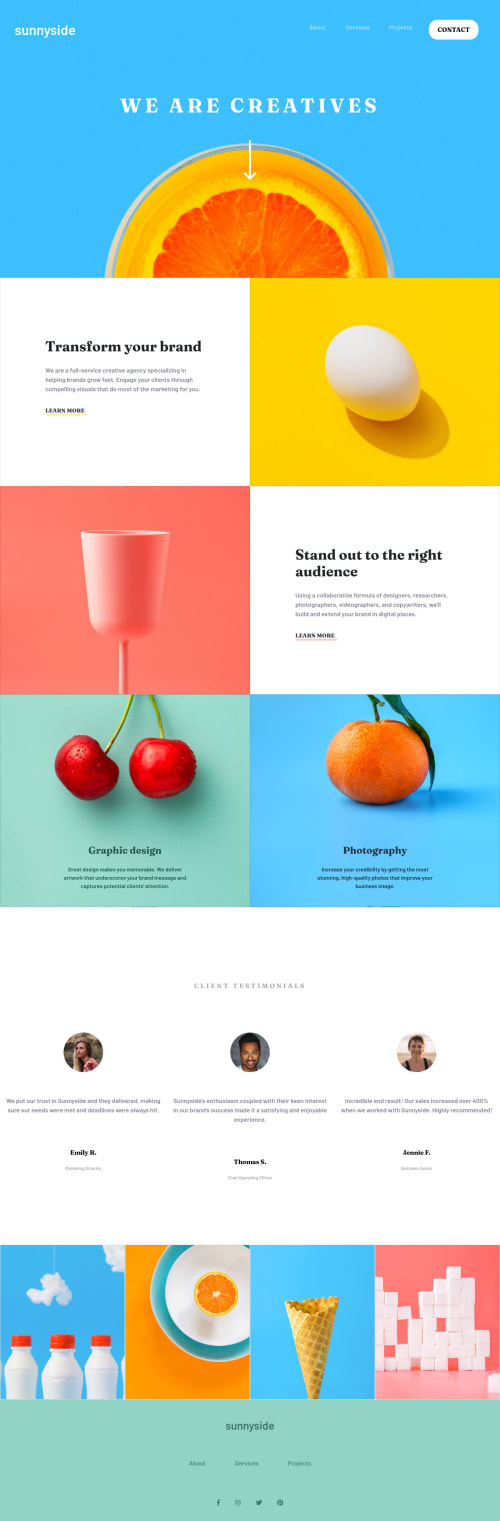
  1. The starting project has images in two directories: mobile and desktop, but I only referenced the desktop images. Am I meant to be using a switching method of sorts that references different images for different screen sizes? If so in the HTML or CSS?

  2. Similarly, I couldn't get the images to fill the entire Bootstrap grid cell. My solution was to place the image into the CSS class of a div and use the background-image property with background-size: cover. But this feels like hiding HTML elements in the CSS. Is there a better way?

Code
Select a file

Please log in to post a comment

Log in with GitHub

Community feedback

  • Shraddha•465
    @5hraddha
    Posted about 4 years ago

    I had similar questions when I was attempting this challenge.

    You can give a read of MDN's Responsive Image section. In the article, they talk about Art direction i.e. wanting to change the image displayed to suit different image display sizes. For example, a web page includes a large landscape shot with a person in the middle when viewed on a desktop browser. When viewed on a mobile browser, that same image is shrunk down, making the person in the image very small and hard to see. It would probably be better to show a smaller, portrait image on mobile, which zooms in on the person. This suits the case in this challenge too. The article suggests to use <picture> element with srcset and media attributes like so:

    <picture>
      <source media="(max-width: 799px)" srcset="elva-480w-close-portrait.jpg">
      <source media="(min-width: 800px)" srcset="elva-800w.jpg">
      <img src="elva-800w.jpg" alt="Chris standing up holding his daughter Elva">
    </picture>
    

    So, for the places where you have used images as background, you can use media queries to switch from desktop images to the mobile ones. And for the places where you have used <img> tag, you can use <picture> element instead.

    Also, there are two minor issues that you can revisit:

    1. We should always give a proper value describing an image to the alt attribute. It is must for accessibility purposes and even if because of some reason the image is not getting displayed on the webpage, this value you specify in the alt attribute will be shown instead.

    2. Please, give a value to href attribute for anchor tags. If you are not sure, at least give href="#", instead of leaving it blank.

    Marked as helpful
  • Sodja Nathan O.•205
    @NateOs
    Posted about 4 years ago

    Its pretty close, great job

Join our Discord community

Join thousands of Frontend Mentor community members taking the challenges, sharing resources, helping each other, and chatting about all things front-end!

Join our Discord

Stay up to datewith new challenges, featured solutions, selected articles, and our latest news

Frontend Mentor

  • Unlock Pro
  • Contact us
  • FAQs
  • Become a partner

Explore

  • Learning paths
  • Challenges
  • Solutions
  • Articles

Community

  • Discord
  • Guidelines

For companies

  • Hire developers
  • Train developers
© Frontend Mentor 2019 - 2025
  • Terms
  • Cookie Policy
  • Privacy Policy
  • License

Oops! 😬

You need to be logged in before you can do that.

Log in with GitHub

Oops! 😬

You need to be logged in before you can do that.

Log in with GitHub

How does the accessibility report work?

When a solution is submitted, we use axe-core to run an automated audit of your code.

This picks out common accessibility issues like not using semantic HTML and not having proper heading hierarchies, among others.

This automated audit is fairly surface level, so we encourage to you review the project and code in more detail with accessibility best practices in mind.

How does the CSS report work?

When a solution is submitted, we use stylelint to run an automated check on the CSS code.

We've added some of our own linting rules based on recommended best practices. These rules are prefixed with frontend-mentor/ which you'll see at the top of each issue in the report.

The report will audit all CSS, SCSS and Less files in your repository.

How does the HTML validation report work?

When a solution is submitted, we use html-validate to run an automated check on the HTML code.

The report picks out common HTML issues such as not using headings within section elements and incorrect nesting of elements, among others.

Note that the report can pick up “invalid” attributes, which some frameworks automatically add to the HTML. These attributes are crucial for how the frameworks function, although they’re technically not valid HTML. As such, some projects can show up with many HTML validation errors, which are benign and are a necessary part of the framework.

How does the JavaScript validation report work?

When a solution is submitted, we use eslint to run an automated check on the JavaScript code.

The report picks out common JavaScript issues such as not using semicolons and using var instead of let or const, among others.

The report will audit all JS and JSX files in your repository. We currently do not support Typescript or other frontend frameworks.

Oops! 😬

You need to be logged in before you can do that.

Log in with GitHub

Oops! 😬

You need to be logged in before you can do that.

Log in with GitHub