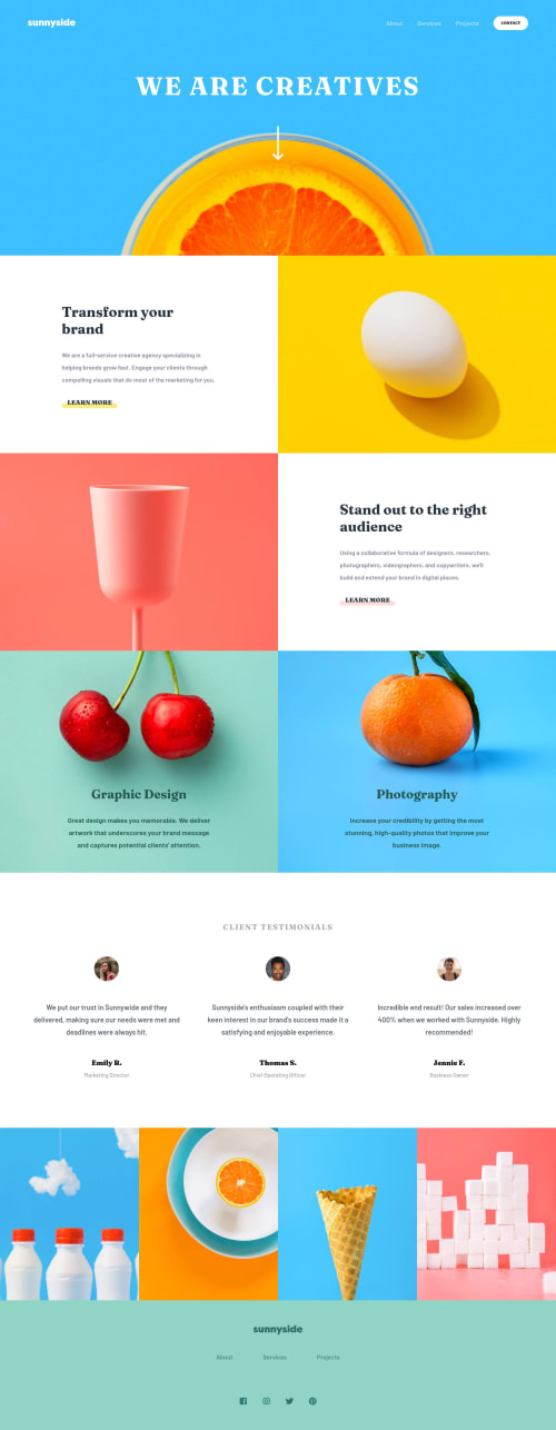
Submitted over 3 years agoA solution to the Agency landing page challenge
Sunnyside Landing Page using Flexbox

@LesleyWesley
Solution retrospective
Hey guys!
Open to any feedback! :)
Code
Please log in to post a comment
Log in with GitHubCommunity feedback
- @pikapikamart
Hey, awesome work on this one. Layout in desktop looks really good, it responds well and the mobile layout is really good as well. This is a nice website.
Some suggestions would be:
- Lose the word "logo" on the
imgaltof the website logo, since it is already an image, no need to describe it as one,alt="sunnyside"would suffice. - On the
learn morelink, if you hover on the element of it in dev tools, you will notice that it doesn't have anyheightthis is because you made thespaninsideposition: absolutewhich makes it out of the flow. I suggest not using thespanand just let the text inside thatspanbe used by theatag directly. That way, it will have dimension and have theoutlineit needed, since it is an interactive element. - When using
blockquotemake sure to add the name of the person inside it, so that it will be read out as well by assistive tech. Making the name of the person as well aheadingtag would be good. - If you use a
sectionthat doesn't have any text embedded inside it, make sure to have atleast a screen-reader only text for that section, the text will be a heading tag, that hassr-onlyclass. You could look up for somesr-onlyand use it.
FOOTER
- Like the above, lose the word
logoon the website-image. - The social media links could have been wrapped inside a
ulelement, since those are "list" of social-media links. - Each
atag that wraps the social media icon should have text inside it so that there will be an extra information that the user will have. It could be asr-onlytext inside theatag, or usearia-labelattribute on theatag, to which the value of both approach will use the name of the social media that they are nesting.
MOBILE
- The hamburger menu should have used
buttonelement and not a checkbox. Thebuttonwill have anaria-label="navigation menu dropdown"or other text, so that users will know what thisbuttonwill do, and thebuttonshould be usingaria-expandedattribute on it as well. - Also, when making a dropdown, make sure that the element or the dropdown is properly hidden to all. Using
transform: scale(0)does not really hide it totally, visually it is hidden but it will be still pick up by assistive tech. Instead, usevisibility: hiddenon it as default, then just transition tovisiblewhen the user toggles the hamburger.
Aside from those, really great work on this one.
Marked as helpful - Lose the word "logo" on the

Join our Discord community
Join thousands of Frontend Mentor community members taking the challenges, sharing resources, helping each other, and chatting about all things front-end!
Join our Discord