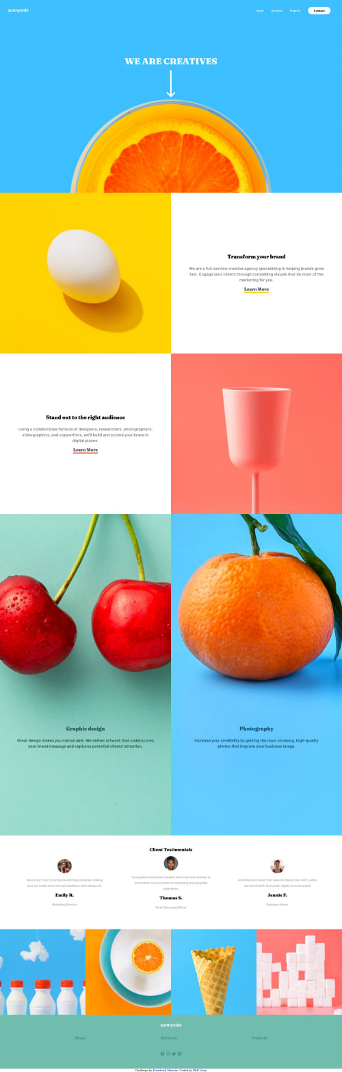
Sunnyside Landing page using flexbox, grid & vanilla JS

Solution retrospective
2 things I could use help on
-
the overflow-x: how do I get rid of the white line on the right side?
-
I used matchMedia to remove the toggle burger/x button when the screen resizes. However when it is shrunk it will disappear. I think it has something to do with the toggling visibility of the drop down nav on the smaller screens but I could not figure it out. Any help would be appreciated :)
Please log in to post a comment
Log in with GitHubCommunity feedback
- @pikapikamart
Hey, great work on this one. Layout in desktop is good and it responds well, the mobile layout is good as well.
Regarding your queries:
- The reason for the extra white line on the right side is your
width: 100vwon thenavelement.width: 100vwandwidth: 100%works different, the100vwtakes all the viewport's width along with the dimension of the supposed scrollbar, that is why there is an extra spacing. You could just remove thatwidthproperty along with theoverflow - You don't really need to use javascript on this part, you could have just use
mediaqueries in the css, like when it is onemedia (min-width: 768px), the hamburger menu is active, then when it is beyond that, just show the desktop layout. You should just use javascript to toggle classes or attributes on that hamburger menu, not using to "show" or "hide" it, let css handle it for you ^^
Some other suggestions would be:
- Your
navshould be inside theheadertag. On this one, I would not include the hero-section in theheader. Typically, top mostheadercontains the website logo-link and the navigational-links. So on this one, the preferred structure would be:
<header> <div> { The website logo image-link is inside here } </div> <nav> { All the list of links are in here } </nav> </header>- Always have a
mainelement on the webpage,mainelement is used to properly navigate your website. A preferred structure again would be:
<header /> <main /> <footer />- The arrow-icon on the hero-section should have
aria-hidden="true"on thesvgelement so that it won't be read by assistive tech since it is just decoration. - When using heading tags, make sure that the lower level heading are present before the current one. For example, if you use
h3make sure thath1, h2are present before it. You use heading tags incrementally by 1. sectionelements could be used as well on this so, especially since there is a testimonial-section.- The
altfor the person for each testimonial should use their names likeimg alt="Emily R"since the image itself is meaningful since it is the user who have the testimonial. - For each images
imgelement that you use, if the element is just decoration, always havealt=""on them, if you don't include that, a screen reader would just read something from the source-code I think, I forgot what it said, but you should always add that, if the image is meaningful, then add a meaningfulaltvalue.
FOOTER
- The links should be inside a
ulelement since those are list of links, also theulshould be inside anavsince those are still your navigational links. - The social media links as well should be wrapped inside
ulelement. - The
titlefor each social mediasvgshould only include the name, remove the wordlogo, when usingtitleoraltdo not add words that relates to "graphic" like "image, logo, icon" assistive tech will handle those for you.
MOBILE
- The hamburger menu should be a
buttonand notatag since it is not a link, rather a control-button for the menu-dropdown. - The hamburger toggler also should have
aria-label="menu dropdown toggler", this will make sure that screen reader users would know what thisbuttondoes. Also it should havearia-expanded="false"as the default and you should change it via javascript. You might want to search about it, or you could reply in here and maybe I can create a simple snippet. - The
svginside the menu-toggler should havearia-hidden="true"since that is just an icon for the dropdown.
Aside from those, really great job on this one.
Marked as helpful - The reason for the extra white line on the right side is your
- @PhilJG
That worked great thanks again Raymart!
- @PhilJG
Hey Raymart,
Thanks so much for your feedback.
I made your adjustments and thank you for enlightening me on best practices for proper html arrangement my knowledge is basically zero and this was the first time I was even aware of aria. I made all the adjustments you suggested except the one about adding aria false to my javascript. I didn`t really understand the concept or what you meant I will have to do more research.
Also, I took your suggestion of removing overflow & and the width from the navbar. It worked, however it messed up my navbar on mobile by squishing it to the left side. Any ideas on how to remedy this issue without causing more overflow?
And many thanks for your feedback it helped me greatly :)
Phil

Join our Discord community
Join thousands of Frontend Mentor community members taking the challenges, sharing resources, helping each other, and chatting about all things front-end!
Join our Discord