Submitted 6 months agoA solution to the Agency landing page challenge
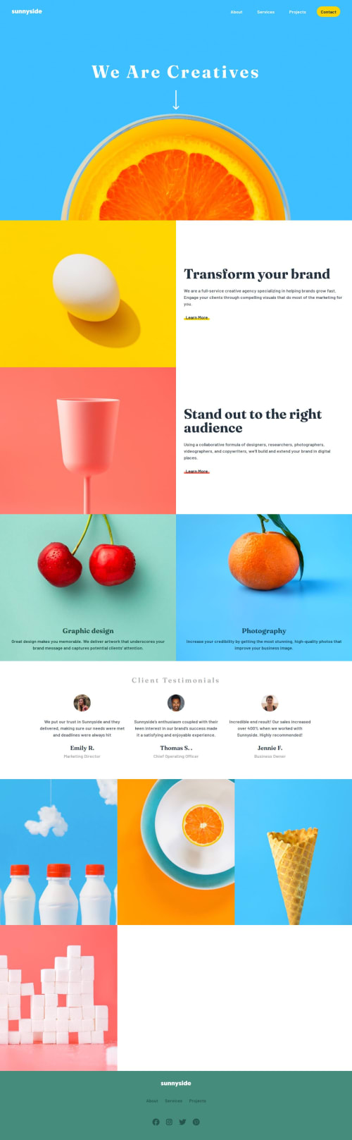
Sunnyside Responsive Landing Page
accessibility, pure-css, van-js

@qayoommunawar
Solution retrospective
What are you most proud of, and what would you do differently next time?
I practiced toggeling between mobile and desktop navbar while using the same html structure.
<h1>Some HTML code I'm proud of</h1>
```<nav id="mobile-menu">
        <ul class="nav-links">
          <li>
            <a href="#">
            About
            </a>
          </li>
          <li>
            <a href="#">
            Services
            </a>
          </li>
          <li>
            <a href="#">
            Projects
            </a>
          </li>
          <li>
            <a href="#" class="btn-primary">
              Contact
            </a>
          </li>
        </ul>
      </nav>
#mobile-menu {
        position: absolute;
        width: 90%;
        height: 250px;
        top: 80px;
        left: 50%;
        transform: translateX(-50%) scaleY(0);
        transform-origin: top;
        background-color: var(--color-white);
        opacity: 0;
        pointer-events: none;
        transition: transform 0.3s ease, opacity 0.3s ease;
}
btnToggle.addEventListener('click', () => {
  if (window.innerWidth < 768) {
    mobileMenu.classList.toggle('active');
    const expanded = btnToggle.getAttribute('aria-expanded') === 'true';
    btnToggle.setAttribute('aria-expanded', !expanded);
  }
});
- how i can manage header+hero section bg without giving header or backgroound img height:100vh; ? because it does not looks good, and the other way if height is not used image is not shown fully.
- should i use fluid-grid style or manage it through media query ?? for example in section.img-gallery i styled images using fluid grid: here is the css snap:
  .grid-gallery{
    display: grid;
    grid-template-columns:
        repeat(
          auto-fit,
          minmax(370px, 1fr)
        );
    justify-content: center;
    align-items: center;
}
- in section-flex which is bascially a grid layout, i set grid-rows so that both the image and text take exactly the same height and width, is this a good practice ? wether i use flex for this ?? what is the best practice in these scenerios ??
  .section-flex{
    display: grid;
    place-content: center;
    grid-template-columns: 1fr;
    grid-template-rows: repeat(2,1fr);
    justify-content: center;
    align-items: stretch;
}
- looking forward to any postive suggestions to enhance my grip on desgin and logic.
Code
Loading...
Please log in to post a comment
Log in with GitHubCommunity feedback
No feedback yet. Be the first to give feedback on Ahmed Ali's solution.
Join our Discord community
Join thousands of Frontend Mentor community members taking the challenges, sharing resources, helping each other, and chatting about all things front-end!
Join our Discord