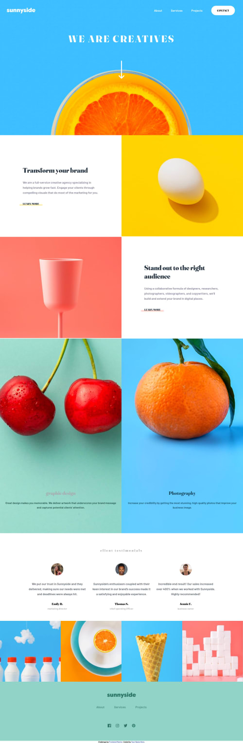
Sunny-side-agency-landingpage_CSS-only.

Solution retrospective
I used input-checkboxes and labels to realize a touchable slide-menu. Thus no JS. I also implemented some utitlity-classes for the design-system (font-properties and colors).
Please feel free to review my code and help me optimize...
Please log in to post a comment
Log in with GitHubCommunity feedback
- @elaineleung
Hi Harm, I think you did a good job putting this together, and it's good to see that you got the testimonials sections fixed 🙂
You do have some other things to fix, and here are my suggestions:
-
Using a fixed
widthandmax-widthon the body selector is something I don't recommend doing because once you're past the max-width, there's only white space that surrounds the sides. I would remove all thewidthandmax-widthproperties on the body, and I'd also change your breakpoint tomin-width:940px. If you need to keep contents from growing past a certain width, you can put a container within the sections that you need that for. -
The yellow image seems to be growing past the left text box when it goes to a certain size; try adding a
object-fit: coverandheight: 100%to make it more contained. You'd also want to make sure that photos that would be cropped within the container all have aobject-fit: cover. -
Lastly, you got some pretty big padding values! I advise not using huge padding like this because in smaller screens, the padding would make the things inside really squished. Instead, try putting everything in a container and then give it a responsive width. For example, in your
card-4, I would create a newdivinside and put all the text in the newdiv, and then I'd usewidth: min()to make sure there's enough space and that it doesn't grow past a certain width:HTML: <div class="card" id="card-4"> <div class="card-container"> <h2>Stand out to the right audience</h2> <p>Using a collaborative formula of designers, researchers, photographers, videographers, and copywriters, we’ll build and extend your brand in digital places. </p> <a href="#">learn more</a> </div> </div> CSS: .card { display: grid; place-content: center; padding: 2rem; } .card-container { width: min(80%, 30rem); // You can experiment with the values here margin-inline: auto; }
Hope this can help you out, and once again, well done!
Marked as helpful -

Join our Discord community
Join thousands of Frontend Mentor community members taking the challenges, sharing resources, helping each other, and chatting about all things front-end!
Join our Discord