Skip to content
  • Unlock Pro
  • Log in with GitHub
Solution
Submitted almost 3 years ago

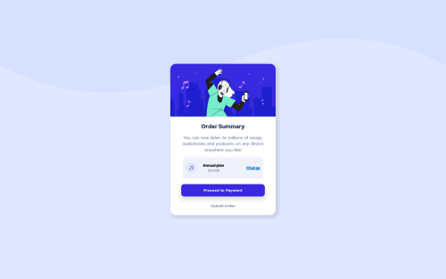
SVG Order Summary Component

yishak abrham•2,150
@yishak621
A solution to the Order summary component challenge
View live sitePreview (opens in new tab)View codeCode (opens in new tab)

Solution retrospective


Built with

  • Semantic HTML5 markup
  • CSS custom properties
  • Flex
  • CSS Grid
  • Mobile-first workflow
  • javascript

What I learned

this project helps me to work friendly with SVG picture backgrounds 1]mixing svg picture backgrounds with background color 2]positioning svg background to y-offset according to design image 3]adding slightly box shadows to buttons and grid

`.grid1x2 {
  box-shadow: 5px 5px 10px 5px rgba(0, 0, 0, 0.1); /*box-shadow: h-offset v-offset blur spread color */
}`
`@media screen and (min-width: 800px) {
  .center {
    display: flex;
    justify-items: center;
    background: url(./images/pattern-background-desktop.svg) no-repeat top;
    background-size: contain;
    background-position-y: -30%;
    background-color: var(--color-secondary);

    justify-content: center;
    align-items: center;
    height: 100vh;
    max-width: 100vw;
  }
}`

i added a little bit of javascript to spice things up ,when the user click on change the subscribe choice is changing.

`function showPlan(currentItem) {
  const item = subscribe[currentItem];
  headText.textContent = item.head;
  price.textContent = item.price;
}`
Code
Select a file

Please log in to post a comment

Log in with GitHub

Community feedback

  • Lucas 👾•104,160
    @correlucas
    Posted almost 3 years ago

    👾Hi @yishak621, congrats on completing this challenge!

    I saw your solution preview site and I think it's already really good. Here’s some tips for you to improve it:

    Your background is applied but its not too similar to the design yet. Add background-size: contain instead of background-size: cover to make it display the size full width and center with the card vertically. Note that now is slightly different from the challenge design.

    Think about using relative units as rem or em instead of px to improve your performance by resizing fonts between different screens and devices.Anyhow, if we want a more accessible website, then we should use rem instead of px. REM does not just apply to font size, but to all sizes as well.

    ✌️ I hope this helps you and happy coding!

    Marked as helpful
  • Hyron•5,870
    @hyrongennike
    Posted almost 3 years ago

    Hi @yishak621,

    Good job on your first attempt of the challenge

    Just a few suggestion. You can add background-repeat: no-repeat on the .center to stop the background from repeating.

    You can either the following rule below you other rules in the CSS file.

    .grid1x2 {
        max-width: 350px;
        height: auto;
        transform: none;
        box-shadow: rgb(149 157 165 / 30%) 0px 8px 24px;
    }
    

    remove the max-width on the .sub and add the following.

    .annual {
        flex-grow: 1;
        text-align: left;
        margin-left: 20px;
        font-size: 1.2rem;
    }
    

    background color of the content.

    .order {
        background: #fff;
    }
    

    This is a good starting point it will get you closer to the design in the challenge.

    Marked as helpful

Join our Discord community

Join thousands of Frontend Mentor community members taking the challenges, sharing resources, helping each other, and chatting about all things front-end!

Join our Discord
Frontend Mentor logo

Stay up to datewith new challenges, featured solutions, selected articles, and our latest news

Frontend Mentor

  • Unlock Pro
  • Contact us
  • FAQs
  • Become a partner

Explore

  • Learning paths
  • Challenges
  • Solutions
  • Articles

Community

  • Discord
  • Guidelines

For companies

  • Hire developers
  • Train developers
© Frontend Mentor 2019 - 2025
  • Terms
  • Cookie Policy
  • Privacy Policy
  • License

Oops! 😬

You need to be logged in before you can do that.

Log in with GitHub

Oops! 😬

You need to be logged in before you can do that.

Log in with GitHub

How does the accessibility report work?

When a solution is submitted, we use axe-core to run an automated audit of your code.

This picks out common accessibility issues like not using semantic HTML and not having proper heading hierarchies, among others.

This automated audit is fairly surface level, so we encourage to you review the project and code in more detail with accessibility best practices in mind.

How does the CSS report work?

When a solution is submitted, we use stylelint to run an automated check on the CSS code.

We've added some of our own linting rules based on recommended best practices. These rules are prefixed with frontend-mentor/ which you'll see at the top of each issue in the report.

The report will audit all CSS, SCSS and Less files in your repository.

How does the HTML validation report work?

When a solution is submitted, we use html-validate to run an automated check on the HTML code.

The report picks out common HTML issues such as not using headings within section elements and incorrect nesting of elements, among others.

Note that the report can pick up “invalid” attributes, which some frameworks automatically add to the HTML. These attributes are crucial for how the frameworks function, although they’re technically not valid HTML. As such, some projects can show up with many HTML validation errors, which are benign and are a necessary part of the framework.

How does the JavaScript validation report work?

When a solution is submitted, we use eslint to run an automated check on the JavaScript code.

The report picks out common JavaScript issues such as not using semicolons and using var instead of let or const, among others.

The report will audit all JS and JSX files in your repository. We currently do not support Typescript or other frontend frameworks.

Oops! 😬

You need to be logged in before you can do that.

Log in with GitHub

Oops! 😬

You need to be logged in before you can do that.

Log in with GitHub