Testimonial Grid (CRA & Tailwind CSS)

Solution retrospective
I'd love general feedback on this project.
The main area I'd love feedback on is how I've displayed the Cards. I've accessed the data individually rather than mapping through my array of objects - mainly because the styling is varied per card and with the layout, it made sense this way.
I am attempting to learn different sections of React at a time and I started off with context to be able to keep all my data in one file and pass it down to the components that need this information.
Please log in to post a comment
Log in with GitHubCommunity feedback
- @theschmocker
Overall, looks great!
Design-related thoughts:
- There are a couple of profile images that aren't quite circles because the images themselves are not square. Something you may consider trying is to set an equal width and height on the image and applying "object-fit: cover". That will crop it to fit within the desired dimensions without making it squish.
- Consider dropping into the single column layout a little sooner at intermediate sizes, some of the skinnier columns get pretty small. Or try experimenting with alternative multi-column layouts at those sizes that have a similar vibe as the large layout, but with less columns
- Adding some padding to the container will help keep the content from hugging the edges of the screen on smaller mobile sizes
- Setting a max width on the grid will help match the design more closely
Semantics/Accessibility
- A page should have a single h1. https://developer.mozilla.org/en-US/docs/Web/HTML/Element/Heading_Elements#multiple_h1_elements_on_one_page What I often do when there's not a clear heading for a page or section is to add one and hide it visually using an "sr-only" class, or similar. That helps to provide context to screenreader users that may be lost when relying on visual hierarchy alone
- I think that have both sections of the testimonial (large, bold text and smaller text below in quotes) as h2s puts them too high within in the document hierarchy, especially given that theres no body content underneath them. Consider a document structure like
- Visually hidden h1 for the page. Something like "Testimonials"
- Names of people and their titles as wrapped in single h2s
- Testimonial content in paragraph tags OR wrap both parts in a single blockquote element
- The page content should be contained within a "main" landmark
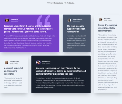
- The quote image in the first card should have an empty alt attribute to signify that it's purely decorative. Otherwise, it just adds noise for screenreaders. Consider doing the same for the thumbnails of the people; they don't add additional context for screenreaders that their name alone doesn't, so I would argue that they're also decorative.
Card rendering thoughts I think the approach you've taken here is reasonable given the data provided. Here are some thoughts that I think might lead down some interesting paths:
- All of the cards could be rendered in a loop and styled using "nth-child" selectors. This could be done in a way that would allow the layout to accommodate more or fewer testimonials
- What if this data was being served from an API that you had control of, or you were in close contact with the developer that worked on the backend? Could you structure the data in such a way that specified where each item lived in the layout and/or how it should be styled?
I hope this is useful!
Marked as helpful

Join our Discord community
Join thousands of Frontend Mentor community members taking the challenges, sharing resources, helping each other, and chatting about all things front-end!
Join our Discord