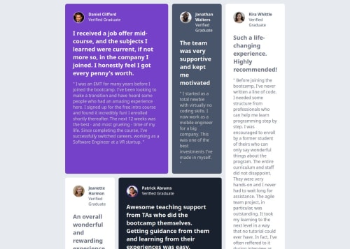
Testimonial Grid Section challenge done with vanilla HTML and CSS

Solution retrospective
Try not to nest them so much
Please log in to post a comment
Log in with GitHubCommunity feedback
- P@Capt-Rong
Your layout is very good!!
But your grid layout seems too tight, so the card content would be squeezed.
- P@totibor
Hello @Antonex, good job implementing the design. I think You could further improve it by giving the testimonial cards more space by removing
width: 65%andwidth: 90%on smaller screens from the.containerclass. In my opinion the padding on the.containergives enough distance from the edge of the screen.Other approach would be to define a smaller (like 13px) font size in the
htmlelement. - @Guilherme-dDiniz
Good your project sir, I believe that to solve the alignment problem I advise you to put the cards inside a single container and put in the body a display: flex; with a justify-content: center; and an align-items: center; to solve the problem.


Join our Discord community
Join thousands of Frontend Mentor community members taking the challenges, sharing resources, helping each other, and chatting about all things front-end!
Join our Discord