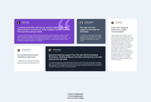
Submitted over 1 year agoA solution to the Testimonials grid section challenge
Testimonial grid section (no libraries)
accessibility, semantic-ui
@efabrizio75

Solution retrospective
What are you most proud of, and what would you do differently next time?
I really liked using the grid features, but I didn't utilize a fluid approach, which I will try in the future.
What challenges did you encounter, and how did you overcome them?Initially I tried using flexbox layout but ran into too many issues, so I decided to revert to a grid layout.
I also noticed the style guide regarding colors to conflict with color contrast. I choose to obey my understanding of the style guide rather than "fixing" the critical accessibility issues.
What specific areas of your project would you like help with?I would like more help in understanding better the style guides.
Code
Loading...
Please log in to post a comment
Log in with GitHubCommunity feedback
No feedback yet. Be the first to give feedback on Emanuele Fabrizio's solution.
Join our Discord community
Join thousands of Frontend Mentor community members taking the challenges, sharing resources, helping each other, and chatting about all things front-end!
Join our Discord