


Web Frog• 1,840
@MasterDev333
Posted
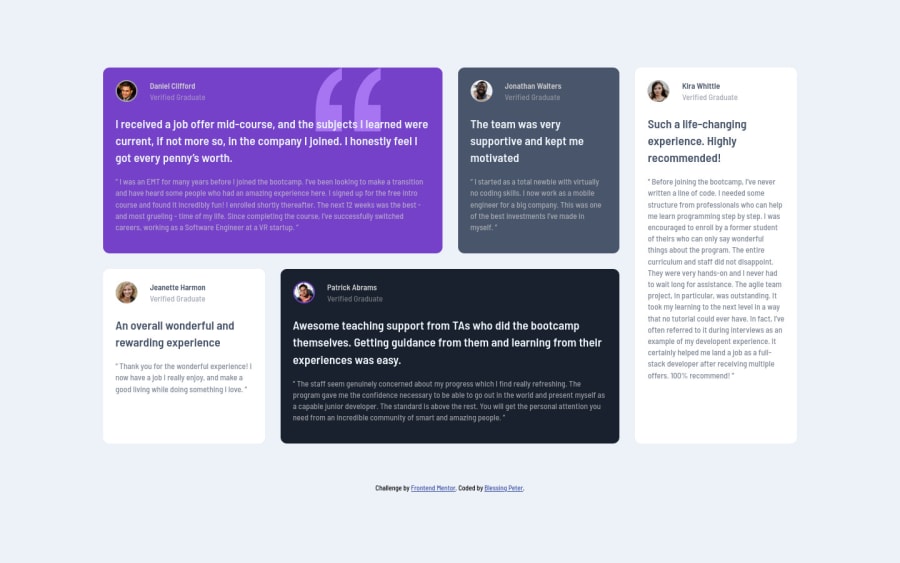
Great work @Bumble Bee! Your solution is spot on. It would be great if you make more responsive in medium screen, especially 1200px. Happy coding~ :)
0
Looking to hire developers?
feedback would be very much appreciated!
@MasterDev333
Posted
Great work @Bumble Bee! Your solution is spot on. It would be great if you make more responsive in medium screen, especially 1200px. Happy coding~ :)
@ApplePieGiraffe
Posted
Hey, Bumble Bee! 👋
Nice job on this challenge! 👍 Your solution looks great and is responsive! 👏
As devMagno suggested, either adding a tablet layout or switching to a mobile layout a little sooner than 600px would be a good idea to prevent the content of the testimonial cards from looking too squeezed right before the layout changes. 😉
Also, adding a max-width to the grid container would be a nice touch to keep the content of the page growing too wide on extra-large screens.
Keep coding (and happy coding, too)! 😁
@ble-syn
Posted
@ApplePieGiraffe thanks for your feedback corrections have been made
@devMagno
Posted
Good job on the challenge It looks pretty cool! 🤩
I suggest adding a media query for tablets or smaller desktop devices because the layout gets kinda weird before reaching the 600px media query. In my solution I created a 2-column layout and I thought it looked really cool, so maybe you should try doing that.
Looking forward to your changes!
Happy coding! 👊
@ble-syn
Posted
@devMagno thank you for your feedback changes have been made
Join thousands of Frontend Mentor community members taking the challenges, sharing resources, helping each other, and chatting about all things front-end!
Join our Discord

