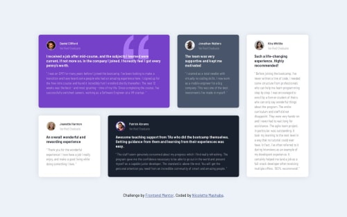
Testimonial Grid Section

Solution retrospective
I’m most proud of successfully implementing a fully responsive testimonial grid using CSS Grid and media queries. The layout adapts well to different screen sizes, and the hover effects add a nice interactive touch. If I were to do this project again, I would explore using CSS clamp() and minmax() for even better responsiveness and experiment with animations to enhance user engagement.
What challenges did you encounter, and how did you overcome them?One of the biggest challenges was structuring the grid layout properly to ensure that the cards aligned correctly across all screen sizes. Initially, some cards were not positioned as expected when switching between breakpoints. I overcame this by refining my media queries, adjusting grid-column and grid-row placements, and testing extensively on different devices. Another challenge was ensuring consistent spacing and alignment, which I resolved by tweaking padding and gap properties in CSS.
What specific areas of your project would you like help with?I’d love feedback on:
Code optimization – Are there any redundant styles or a better way to structure my CSS? Accessibility – How can I improve accessibility for better usability? Performance – Are there any best practices I should follow to optimize performance, especially for larger grids?
Please log in to post a comment
Log in with GitHubCommunity feedback
No feedback yet. Be the first to give feedback on Nicolette Reneilwe Mashaba's solution.
Join our Discord community
Join thousands of Frontend Mentor community members taking the challenges, sharing resources, helping each other, and chatting about all things front-end!
Join our Discord