Not Found
Not Found
Not Found
Not Found
Not Found
Not Found
Not Found
Not Found
Not Found
Not Found
Not Found
Not Found
Not Found
Not Found
Not Found
Not Found
Not Found
Not Found
Not Found
Not Found

Submitted

Testimonial Grid with Mobile First + GRID + Responsive

P
AKβ€’ 6,700

@skyv26

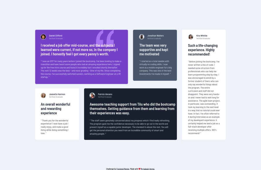
Desktop design screenshot for the Testimonials grid section coding challenge

This is a solution for...

  • HTML
  • CSS
2junior
View challenge

Design comparison


SolutionDesign

Solution retrospective


I will appreciate any feedback. Please check my work and leave your feedback.

Community feedback

P
Remus D. Buhaianuβ€’ 3,145

@Miculino

Posted

Good job on completing the challenge, Aakash!

Your final solution looks good and I like how responsive you've made it. I have to admit that I was surprised to see that you had over 800 lines of code :)

Btw, I think this resource will be useful to you https://css-tricks.com/look-ma-no-media-queries-responsive-layouts-using-css-grid/

At around 1073px resolution, some of the cards' height don't span completely to the bottom, so you might want to review some of the code that affects the row and column span of the grid items.

Good job again on finishing this challenge!

Marked as helpful

2

P
AKβ€’ 6,700

@skyv26

Posted

@Remus432 Thank you Remus, I think I need work more on Grid, As i made project using grid, but long time ago, that's why while working on this I really messed up. But Sure 😊 I will check that link for reference and soon I will upload new solution based on Grid

0
Elroy Toscanoβ€’ 630

@elroytoscano

Posted

Hi Aakash, good job with the design. There's just a little box shadow missing on Kira and Jeanette's cards.

Seeing through your code, you've used p tags for each article's title/persona name, instead, swap them for h2 tags to improve the semantic correctness as even each article/section needs a heading tag.

Download AXE dev tools so that you can clear any accessibility issues while coding : https://www.deque.com/axe/devtools/

Hope this helps.

Marked as helpful

1

P
AKβ€’ 6,700

@skyv26

Posted

@elroytoscano Thanks, but I think there is no need of heading inside the article.

0
Anosha Ahmedβ€’ 9,340

@anoshaahmed

Posted

Great work friend! Looks good and is very responsive. One thing I notice is that Jonathan, Jeanette and Kira's boxes become small, so you might want to add a minimum height or something

Marked as helpful

1

P
AKβ€’ 6,700

@skyv26

Posted

@anoshaahmed Yes, Anosha, I really messed with this, honestly I am not happy with this solution.

1
Anosha Ahmedβ€’ 9,340

@anoshaahmed

Posted

@skyv26 If your "messy solution" can work about perfectly, then that just shows that you're good at what you do, and you know what you can do

Marked as helpful

1

Please log in to post a comment

Log in with GitHub
Discord logo

Join our Discord community

Join thousands of Frontend Mentor community members taking the challenges, sharing resources, helping each other, and chatting about all things front-end!

Join our Discord