Submitted over 3 years agoA solution to the Testimonials grid section challenge
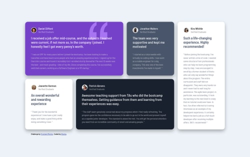
Testimonials Grid

@shainakhan06
Solution retrospective
Feedbacks are always welcome. let me know where i messed up Happy Coding..!!
Code
Loading...
Please log in to post a comment
Log in with GitHubCommunity feedback
No feedback yet. Be the first to give feedback on Shaina Khan's solution.
Join our Discord community
Join thousands of Frontend Mentor community members taking the challenges, sharing resources, helping each other, and chatting about all things front-end!
Join our Discord