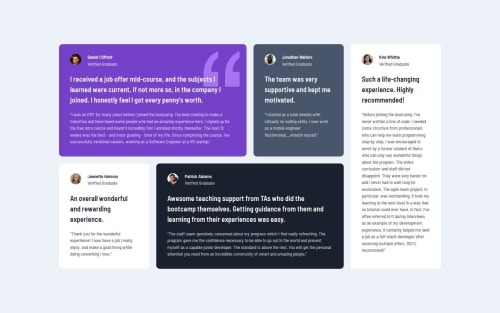
Testimonials grid section - HTML, CSS, Grid

Solution retrospective
I used grid-template-columns: repeat(auto-fill, minmax(350px, 1fr)); and grid-auto-rows: auto; to achieve a smoother transition between mobile and desktop views. This approach allowed the grid items to resize dynamically, providing a more responsive and flexible layout.
The only little challenge was ensuring that the grid layout maintained a clean and responsive design across different screen sizes.
What specific areas of your project would you like help with?I would like to get general feedback on whether there are better solutions for this type of layout. I'm curious to know if I made any mistakes or if there are more efficient approaches to achieve the same result. Any suggestions for improving the structure, responsiveness, or overall code quality are welcome.
Please log in to post a comment
Log in with GitHubCommunity feedback
- @matiasaltier
Excellent work, nice and smooth layout, very good semantics with use of minwidth, rem, gap. You could add the svg quot in the violet testimony (with a bg-img and bg-position)
- @flaviocmb
Well done! But you're missing the background image from the violet card. Also noticed responsiveness issues at low resolutions.


Join our Discord community
Join thousands of Frontend Mentor community members taking the challenges, sharing resources, helping each other, and chatting about all things front-end!
Join our Discord