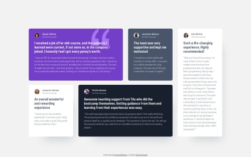
Testimonials grid section - Tailwind CSS, Next.js

Solution retrospective
I am proud that outside of Tailwind CSS, I used custom CSS to create responsive grid views for multiple screen widths. Specifically, I used grid template areas to make these responsive layouts.
What challenges did you encounter, and how did you overcome them?The challenge I encountered was that nearly every testimonial looked different. For this, I targeted each testimonial card using the CSS :nth-child() selector and applied its specific style.
Did I miss something? Is there anything I can do better? I am open to any constructive feedback.
Please log in to post a comment
Log in with GitHubCommunity feedback
- @mofada
First of all, congratulations on completing the challenge. It's done very well, awesome!
First of all, from the HTML semantics point of view, it's awesome, I can't fault it. Secondly, you also added hover animation, which is a good attempt. And responsive matching, it's perfect, awesome

Join our Discord community
Join thousands of Frontend Mentor community members taking the challenges, sharing resources, helping each other, and chatting about all things front-end!
Join our Discord