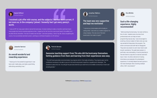
Submitted over 2 years agoA solution to the Testimonials grid section challenge
CSS Grid & Responsive Mobile-First Design

@hossamfawzy777
Solution retrospective
This is a good CSS Grid Practice with Responsive Design. I tried to match the original design as much as I could. I appreciate your review and feedback.
Code
Please log in to post a comment
Log in with GitHubCommunity feedback
- Account deleted
Hey there! 👋 Here are some suggestions to help improve your code:
- To properly center your content to your page, you will want to add the following to your
Bodyelement (this method uses CSS Grid):
body {
    min-height: 100vh;
    display: grid;
    place-content: center;
}
More Info:📚
- For the profile images Alt Tag Description, it should never* include the following keywords; “image”, “photo”., “picture” and any variation of them.
- The only headings in this component are the names of each individual; “Daniel Clifford”, “Jonathan Walters”, “Jeanette Harmon”, “Patrick Abrams” and “Kira Whittle”. Everything else should be wrapped in a paragraph Element.
- To improve the semantics of your component, you will want to wrap each individual testimonial component in a
figureelement, the individuals information should be wrapped in afigcaptionelement and lastly, the testimonial itself should be wrapped in ablockquoteelement.
Code:
<figure>
   <figcaption></figcaption>
   <blockquote></blockquote>
</figure>
More Info:📚
If you have any questions or need further clarification, feel free to reach out to me.
Happy Coding!🎄🎁
- To properly center your content to your page, you will want to add the following to your
Join our Discord community
Join thousands of Frontend Mentor community members taking the challenges, sharing resources, helping each other, and chatting about all things front-end!
Join our Discord