Not Found
Not Found
Not Found
Not Found
Not Found
Not Found
Not Found
Not Found
Not Found
Not Found
Not Found
Not Found
Not Found
Not Found
Not Found
Not Found
Not Found
Not Found
Not Found
Not Found

Submitted

Testimonials grid section

Amos 470

@fistty

Desktop design screenshot for the Testimonials grid section coding challenge

This is a solution for...

  • HTML
  • CSS
2junior
View challenge

Design comparison


SolutionDesign

Solution retrospective


⭐ Added a tablet layout

Feedbacks are much appreciated.

Community feedback

Lucas 👾 104,580

@correlucas

Posted

Hello Amos, congratulations for this amazing solution.

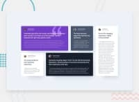
Ai can see that you've paid attention to all details sincs you've added the border circle to the purple and black card, tablet media query and other stuff, that's really cool. Congrats.

My advice for you is more about semantic, instead of using div for each card you can use section or article for a meaningful element. And for the quotes instead of p use <blockquote> thats the exact description for this element.

Hope it helps and happy coding ✌️

Marked as helpful

1

Amos 470

@fistty

Posted

@correlucas Thanks checked and changed.

0

Please log in to post a comment

Log in with GitHub
Discord logo

Join our Discord community

Join thousands of Frontend Mentor community members taking the challenges, sharing resources, helping each other, and chatting about all things front-end!

Join our Discord