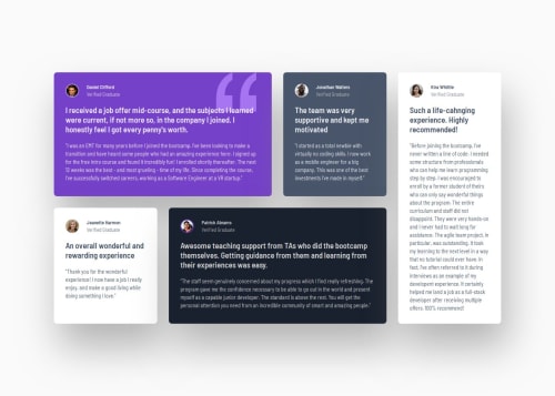
Testimonials grid section

Solution retrospective
it seems that I'm unable to understand what rem and em are and when to use them :sob:
Please log in to post a comment
Log in with GitHubCommunity feedback
- @thisisharsh7
Great work on your project! The CSS and HTML are well-structured, and regarding your question on
remandem:-
rem (root em): Use
remfor things like spaces or font sizes when you want them to stay the same everywhere. This is like a ruler that measures everything based on one big size—the size set at the very top of your webpage (the<html>tag). Usually, this is 16 pixels (px). So, if you say1rem, it’s 16px, no matter where you are on the page.Example: If you set
font-size: 1remon a title, it’s always 16px (if the root is 16px). -
em: This is like a ruler that changes based on the parent (the box your text lives in). If the parent’s font-size is 20px, then
1emequals 20px. Useemwhen you want sizes to depend on the parent’s size, like making text or spacing grow or shrink with it.Example: If a parent has
font-size: 20px, thenpadding: 1emmeans 20px of space. -
How they help in responsive design:
- rem: Makes your site look great on all devices because you can change the root font size (in
<html>) for smaller screens. For example, sethtml { font-size: 14px }for phones, and allremsizes shrink automatically, keeping everything proportional. - em: Helps parts of your design (like buttons or text inside a box) scale with their parent’s size. If you make the parent’s font smaller on a phone,
emsizes adjust too, making things fit perfectly.
- rem: Makes your site look great on all devices because you can change the root font size (in
Try this:
html { font-size: 16px; } /* Default for desktops */
.parent { font-size: 20px; }
.title { font-size: 1rem; } /* 16px on desktop */
.text { font-size: 1em; } /* 20px, follows parent */
@media (max-width: 600px) {
  html { font-size: 14px; } /* rem shrinks to 14px on phones */
  .parent { font-size: 18px; } /* em adjusts to 18px */
}
Hope this helps-Keep up the great work!
Marked as helpful -

Join our Discord community
Join thousands of Frontend Mentor community members taking the challenges, sharing resources, helping each other, and chatting about all things front-end!
Join our Discord