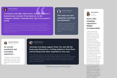
Submitted over 3 years agoA solution to the Testimonials grid section challenge
Testimonials grid section CSS

@Scott-Wilder
Solution retrospective
I felt using grid, width, and margin to get the desktop view was a bit hacky, please let me know if you found a better solution for the desktop layout, thanks!
Code
Loading...
Please log in to post a comment
Log in with GitHubCommunity feedback
No feedback yet. Be the first to give feedback on Scott Wilder's solution.
Join our Discord community
Join thousands of Frontend Mentor community members taking the challenges, sharing resources, helping each other, and chatting about all things front-end!
Join our Discord