


@correlucas
Posted
👑Hello Queen, congratulations for your new solution!
Here's some tips to improve your solution:
Add min-height: 100vh to align the container to the body with flexbox this way the body has 100% of the viewport height. Then add the correct size for the container max-width: 1110px
.container {
    max-width: 1110px;
    margin: 0 auto;
    padding: 1.2em;
    display: grid;
    grid-template:
        "col-1 col-1 col-2 col-5"
        "col-3 col-4 col-4 col-5";
}

body {
    min-height: 100vh;
    background-color: var(--Light_grayish_blue);
    color: var(--White);
    font-family: "Barlow Semi Condensed", sans-serif;
    font-size: 13px;
    display: flex;
    align-items: center;
    justify-content: center;
}
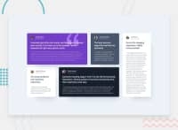
The paragraph with the quote with the property tag <blockquote> this way you'll wrap each block of element with the best tag in this situation.
👋 I hope this helps you and happy coding!
Marked as helpful
@UmesiQueen
Posted
Hey @correlucas , Thank you very much for your feedback. I found your tips helpful. I have now implemented these changes and my solution looks better.
However, I noticed it had no effect on my design comparison even though I have pushed my changes to github. Do you have any suggestions on how I can resolve this? Thank you!
@correlucas
Posted
@UmesiQueen You click on your solution to update the screenshot in the solution panel to have the last version of your page.
@UmesiQueen
Posted
@correlucas Done. Thanks a bunch
