Testimonials Grid Section (HTML, CSS)

Solution retrospective
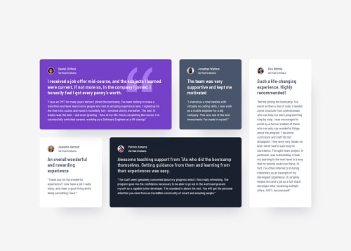
The responsive part of the grid was accaptable at first try. Styling of the cards a bit messy, needs to have a better approach next time.
What challenges did you encounter, and how did you overcome them?In case of this design all of the cards has major and minor design charactarectis which made it hard to create a simple, unified styling. I think this design is a good case for Tailwind and utility classes in general. Needs to dive deeper in the future to see its benefits.
Please log in to post a comment
Log in with GitHubCommunity feedback
- P@Jdaans
All I can really see that is off is the placement of the main container but it's barely off, and your box shadows aren't as visible, I have nothing to add to fix it though it looks really good, awesome job!
Join our Discord community
Join thousands of Frontend Mentor community members taking the challenges, sharing resources, helping each other, and chatting about all things front-end!
Join our Discord