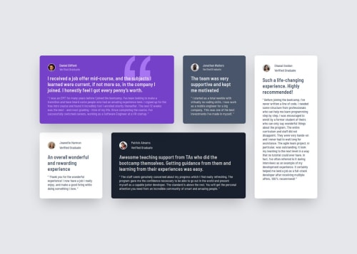
Testimonials Grid Section

Solution retrospective
I'm most proud of how clean and responsive the layout turned out using Tailwind CSS. I effectively used utility classes to build a modern, visually appealing testimonial grid that adjusts well on different screen sizes. Implementing the grid layout and customizing background images were both great learning experiences and helped me become more comfortable with Tailwind’s responsive and positioning tools.
If I were to do this project again, I would:
Refine accessibility by improving alt attributes and semantic labeling to better support screen readers.
Clean up placeholder text, like the <title> tag, and proofread more carefully to catch small typos like "developent".
Use componentization, especially if working in a framework like Vue or React, to make each testimonial reusable and more maintainable.
Improve mobile spacing by tweaking max-width values and adding more responsive design considerations for small screens.
What challenges did you encounter, and how did you overcome them?One challenge I faced was managing the layout across different screen sizes, especially ensuring that the testimonial cards looked balanced and aligned in both mobile and desktop views. I overcame this by experimenting with Tailwind's responsive grid utilities like lg:col-span and lg:grid-cols, and using custom width constraints like max-w-[70rem] to control the layout at larger breakpoints.
Another challenge was getting the background image positioned properly in the purple testimonial card. Tailwind doesn’t always make custom background positions straightforward, so I had to research how to use bg-[url()] along with a custom bg-position using bg-[position] syntax. This was a great opportunity to dig deeper into Tailwind’s JIT (Just-In-Time) features and understand how to write arbitrary values.
I also encountered minor issues with color class names like bg-grey-500, and realized Tailwind uses American spelling (gray, not grey). This was a simple fix, but it reminded me to double-check class names against the Tailwind documentation.
What specific areas of your project would you like help with?I’d like help with a few specific areas to improve both the code quality and user experience:
Mobile responsiveness tuning – While the layout works on different screen sizes, I feel like the spacing and readability on smaller devices could be improved. I’d appreciate feedback or suggestions on how to better handle typography and layout scaling for mobile.
Accessibility best practices – I want to make sure the project is accessible to all users. I'm interested in learning more about how to properly use semantic HTML, alt attributes, and ARIA roles when needed.
Better image optimization – I used standard .jpg images, but I’m not sure if this is ideal for performance. Any advice on image formats (like WebP), compression, or lazy loading would be helpful.
Component structure for frameworks – Eventually, I want to convert this layout into a component-based structure using Vue or React. Tips on how to break this layout into reusable components effectively would be great.
Please log in to post a comment
Log in with GitHubCommunity feedback
- P@Snah19
Nice, solution! Almost perfect to me, also what a great writing skill

Join our Discord community
Join thousands of Frontend Mentor community members taking the challenges, sharing resources, helping each other, and chatting about all things front-end!
Join our Discord