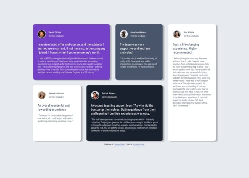
Testimonials-grid-section KD

Solution retrospective
I think I am most proud of how I flipped to desktop first vs mobile first process and was able to break down the element design little by little without any excessive confusion. I think I would try not using any margin on the cards to create separation and implement grid right away. I kept getting confused of why the vertical gap between my cards were so big until I found out I had a margin-block-end on them.
What challenges did you encounter, and how did you overcome them?I think my challenge was using CSS grid, I was rusty in the area and had a little difficulty trying to position all the items. I lack fundamental knowledge of what properties were available such as using grid template area vs grid-template columns combined with grid-template rows initially and it confused me when I tried to implement it the latter. I overcame this by doing research on google and playing around with the properties.
What specific areas of your project would you like help with?-Can someone explain how you can use grid-column and grid-row to make certain items span certain areas -Can someone explain how to make sure my project fits the screen and is not oversized or anything? Also to make sure proportions are correct with my solution. I can see that it is bulky compared to the design shown. -How to make text fill out as it is intended to for the entire space of an element?
Please log in to post a comment
Log in with GitHubCommunity feedback
No feedback yet. Be the first to give feedback on dongkp96's solution.
Join our Discord community
Join thousands of Frontend Mentor community members taking the challenges, sharing resources, helping each other, and chatting about all things front-end!
Join our Discord