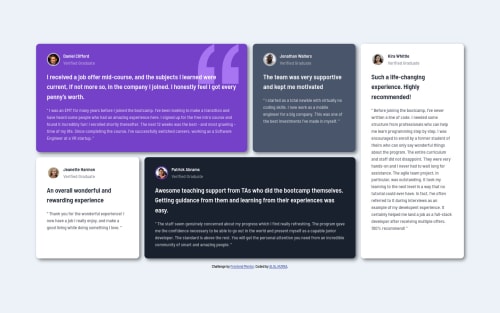
Testimonials grid section using CSS Grid

Solution retrospective
Hello guys! This is my first time implementing CSS Grid. What do you guys think? :D I added a little animation for desktop view only. Is it suitable or do you feel like the animation is annoying? I have one question, how to practice cross-browser compatibility? I'm open to any suggestion and criticism. Thank you in advance.
Please log in to post a comment
Log in with GitHubCommunity feedback
- @ApplePieGiraffe
Hey, great job on this challenge, ah298! 👍
The animation you added is definitely eye-catching! 😆
Your grid also responds quite well! 🙌
I suggest,
- Setting a
max-widthon the main container or wrapper so that the content of the page doesn't look too stretched on large screens. - Perhaps the testimonials section doesn't really need that much attention from adding an eye-catching animation like that, but I think it's fine for a simple challenge like this (just for fun and for practice, you know!).
For your question on cross-browser compatibility, check out caniuse.com—a popular website where you can type in the name of any CSS property and it'll tell you which browsers (and what versions of those browsers) support it. Of course, don't forget to check your website using different browsers yourself (Chrome, Firefox, Safari, Edge, etc.)!
Keep coding (and happy coding, too)! 😁
- Setting a
- @shaw12
It's awesome man, i am very impressed with the animation.


Join our Discord community
Join thousands of Frontend Mentor community members taking the challenges, sharing resources, helping each other, and chatting about all things front-end!
Join our Discord