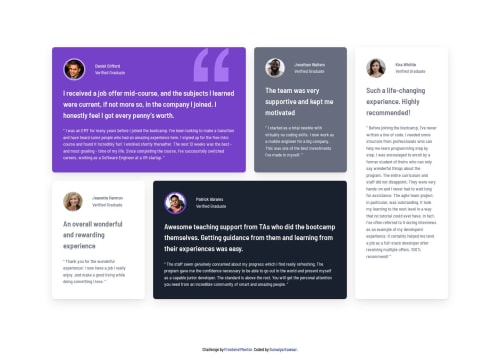
Testimonials grid section using Grid

Solution retrospective
I’m most proud of successfully implementing the mobile-first approach in SCSS, ensuring that the design is optimized for smaller screens before scaling up to larger devices. This approach helped create a more responsive and user-friendly experience, improving performance and usability on mobile devices. I also appreciated how structuring styles from small to large made the code more maintainable and scalable.
What specific areas of your project would you like help with?I'd appreciate any feedback. If there are any best practices I may have overlooked, I’d love to hear suggestions for improvement.
Please log in to post a comment
Log in with GitHubCommunity feedback
No feedback yet. Be the first to give feedback on Sumaiya Kawsar's solution.
Join our Discord community
Join thousands of Frontend Mentor community members taking the challenges, sharing resources, helping each other, and chatting about all things front-end!
Join our Discord