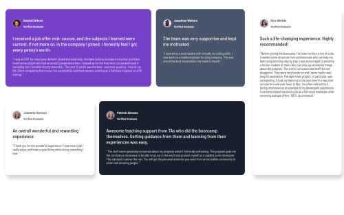
Testimonials Grid Section Using Pure CSS

Solution retrospective
Hey Everyone, I have completed the Testimonials Grid Section challenge.
Check out my following article, where I have briefly explained the steps I have followed to complete this challenge.
https://medium.com/ux-planet/challenge-010-testimonials-grid-section-9067105b9ff
Thank you for checking this out, and feel free to leave your feedback and thoughts!! Any feedback and tips are welcome.
Many Thanks! Nathasha 😊
Please log in to post a comment
Log in with GitHubCommunity feedback
- @Shalom2935
Hey @Nathasha, I really like the way you explain every step of your code. Some ideas to improve your code:
- Wrap the code inside the body in a main element instead of a div; that will make your code more semantic therefore fix the accessibility issue.
- The .parent-wrapper element is too wide, give it a width of 80% instead of max-width:1440px.
- I think doing it with flexbox is too much work, learn the css grid and you will see how simple it could have been.
- There is quote in the background of .daniell-tetional-wrapper that you missed. Two ideas to help you choose what suit you the most. 1- give the .daniell-tetional-wrapper a relative position, give the quote you want in the background an absolute position; use top and right properties to adjust his position, then use the z-index so that the quote will be beneath the text. 2- place the quote as the background-image of .daniell-tetional-wrapper, then adjust his position with background-position: top; and background-position-x: "value_that_will_work".
- Your responsive is designed only for large and small screen's size, it would be very nice if you added a medium size screen.
I hope my comments will help you somehow, happy coding journey.
Join our Discord community
Join thousands of Frontend Mentor community members taking the challenges, sharing resources, helping each other, and chatting about all things front-end!
Join our Discord